

Curative treatment feat. fascinating holiday
2015
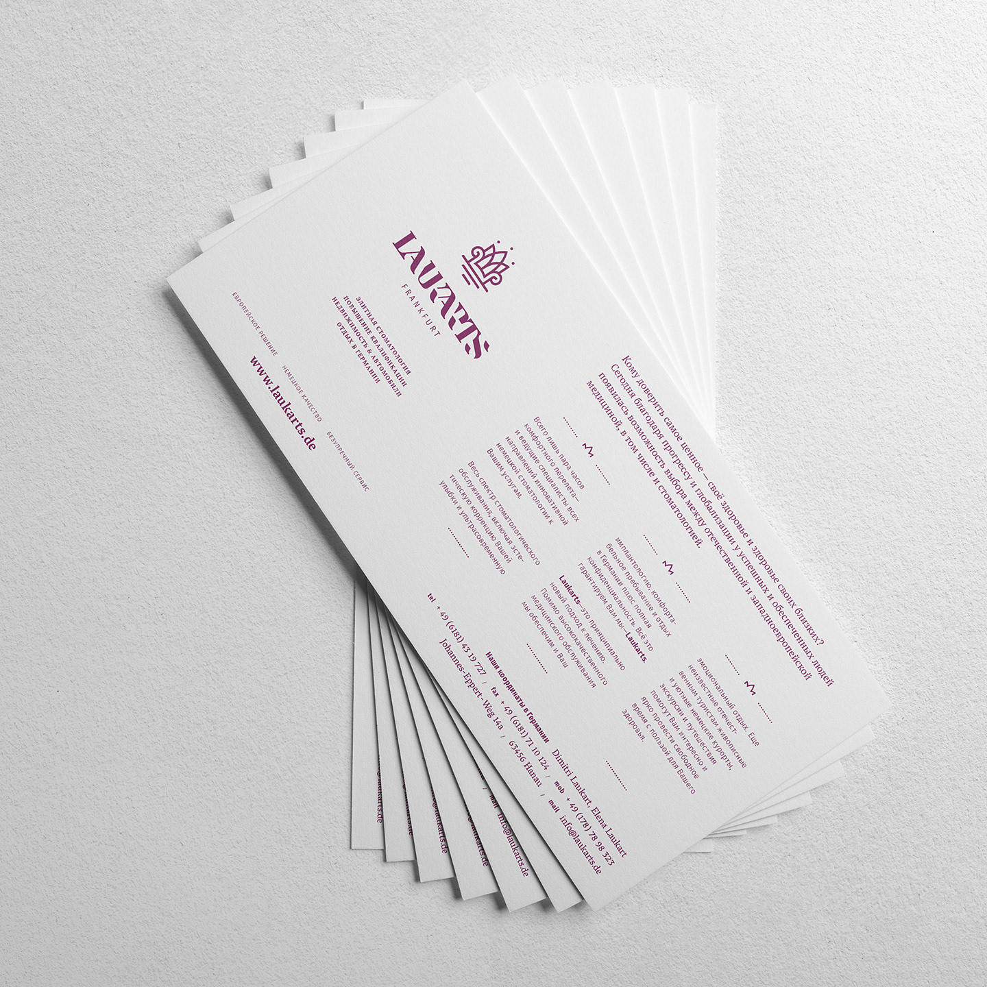
The idea of symbiosis between a curative treatment and a fascinating holiday: Laukarts dental services. From mediating & establishing the best possible accomodation to the organisation precisely required therapy, Laukarts’ broad spectrum of services guarantees you a nice smile and a lot of unforgettable memories. You will be treated by best experts of german dentistry, whose services are appreciated by the german high-society. Furthermore Laukarts orginizes advanced training courses for dentists, who recognize the necessity of ongoing vocational training.
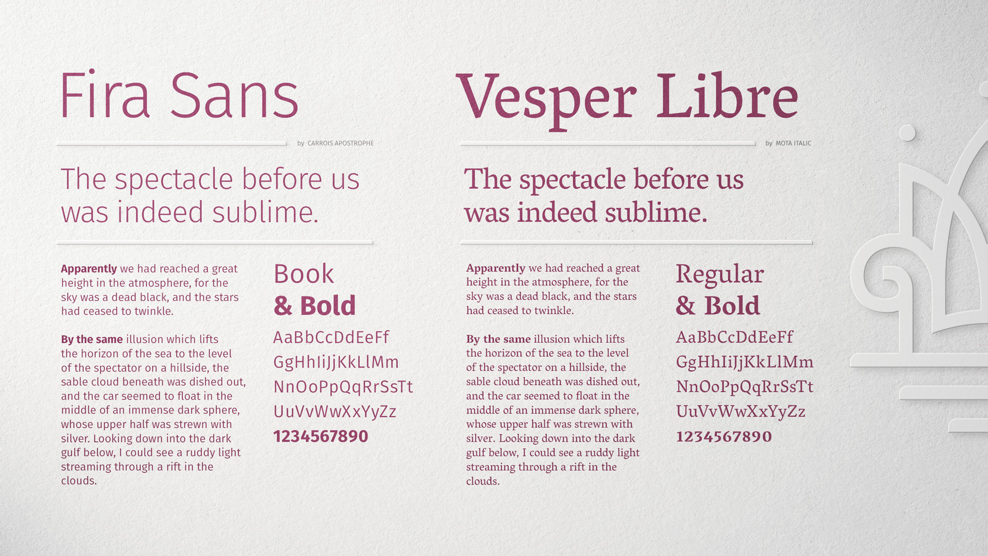
Art Direction
Logodesign
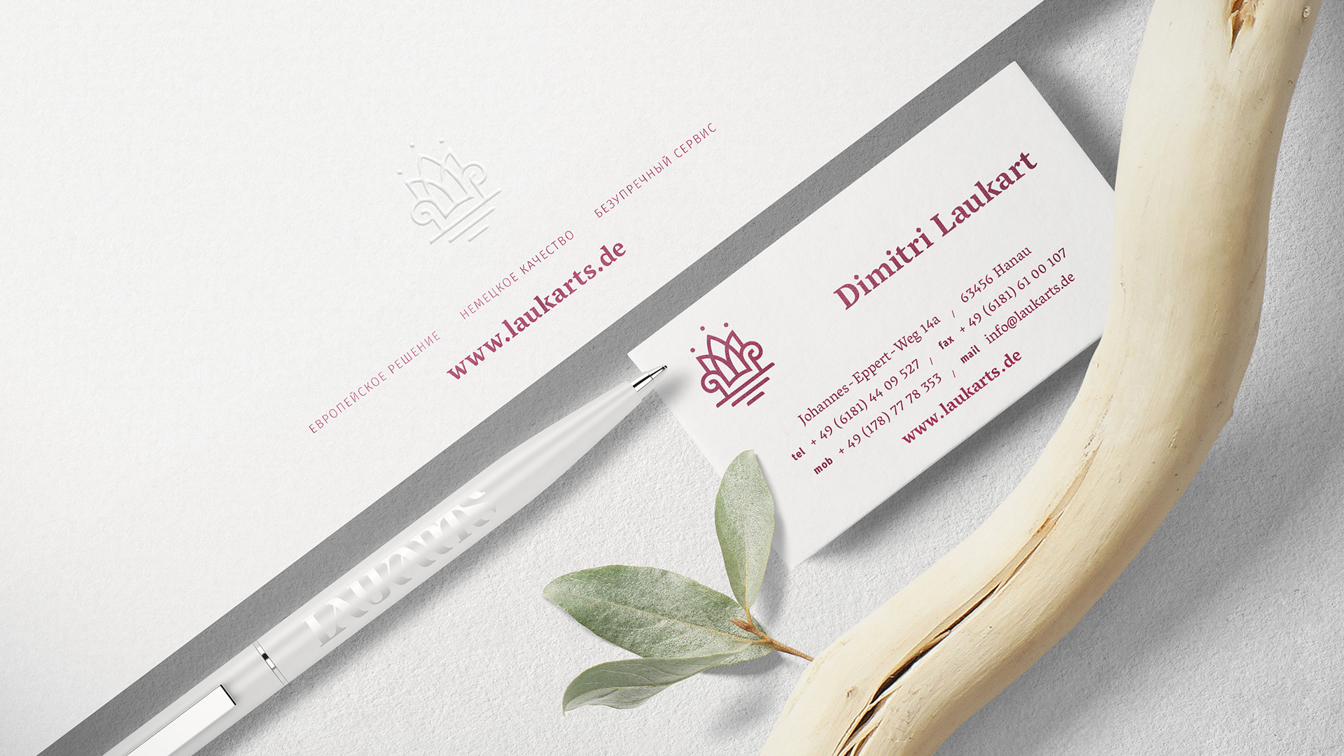
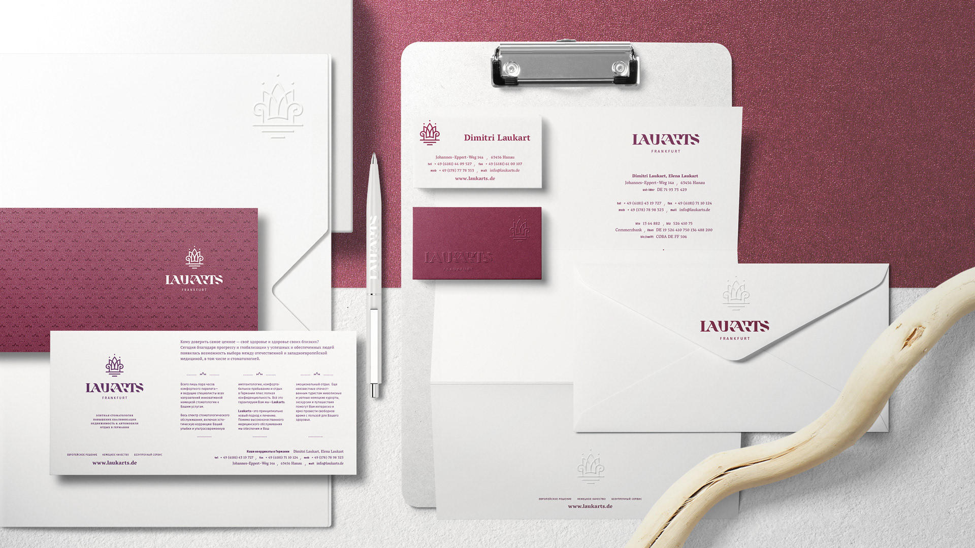
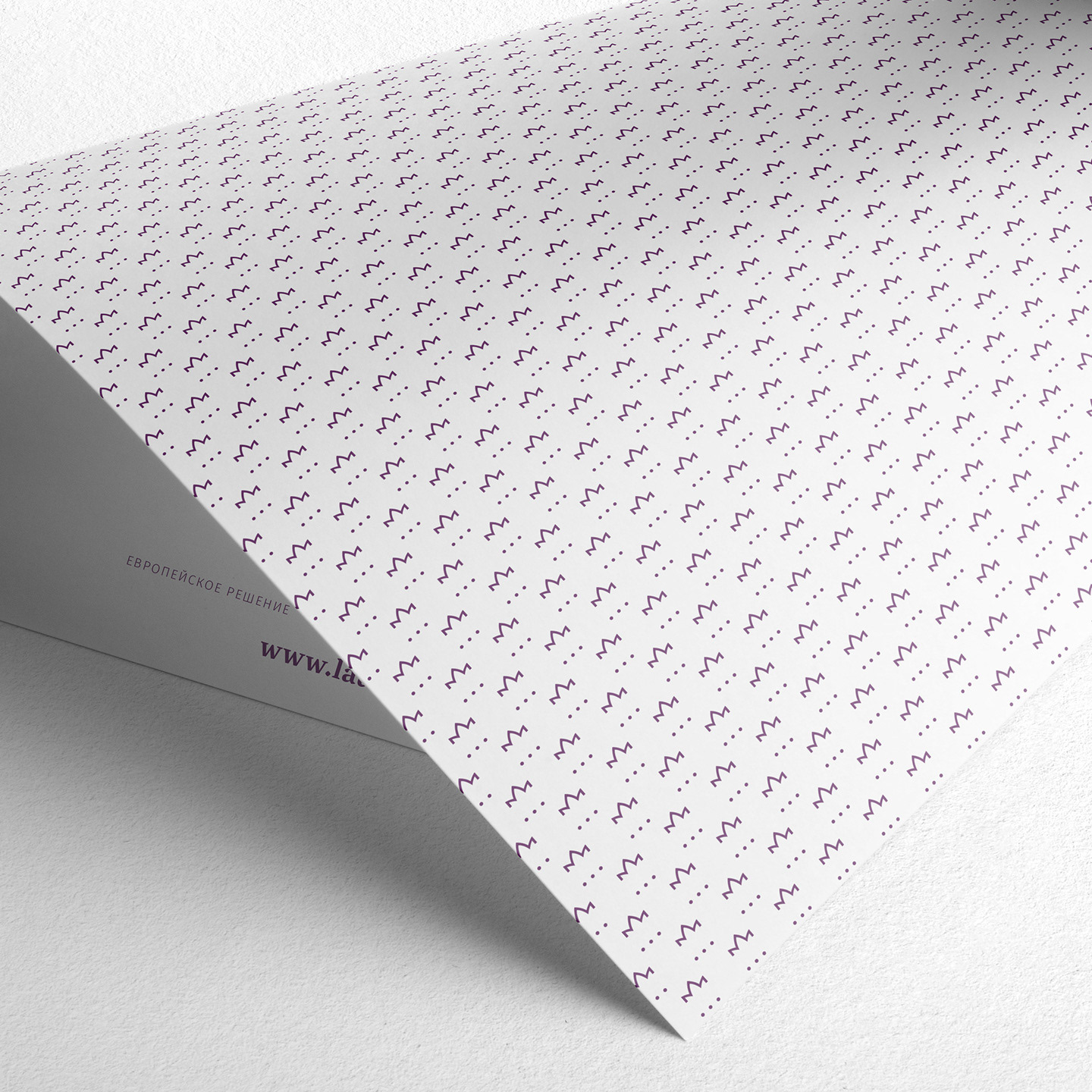
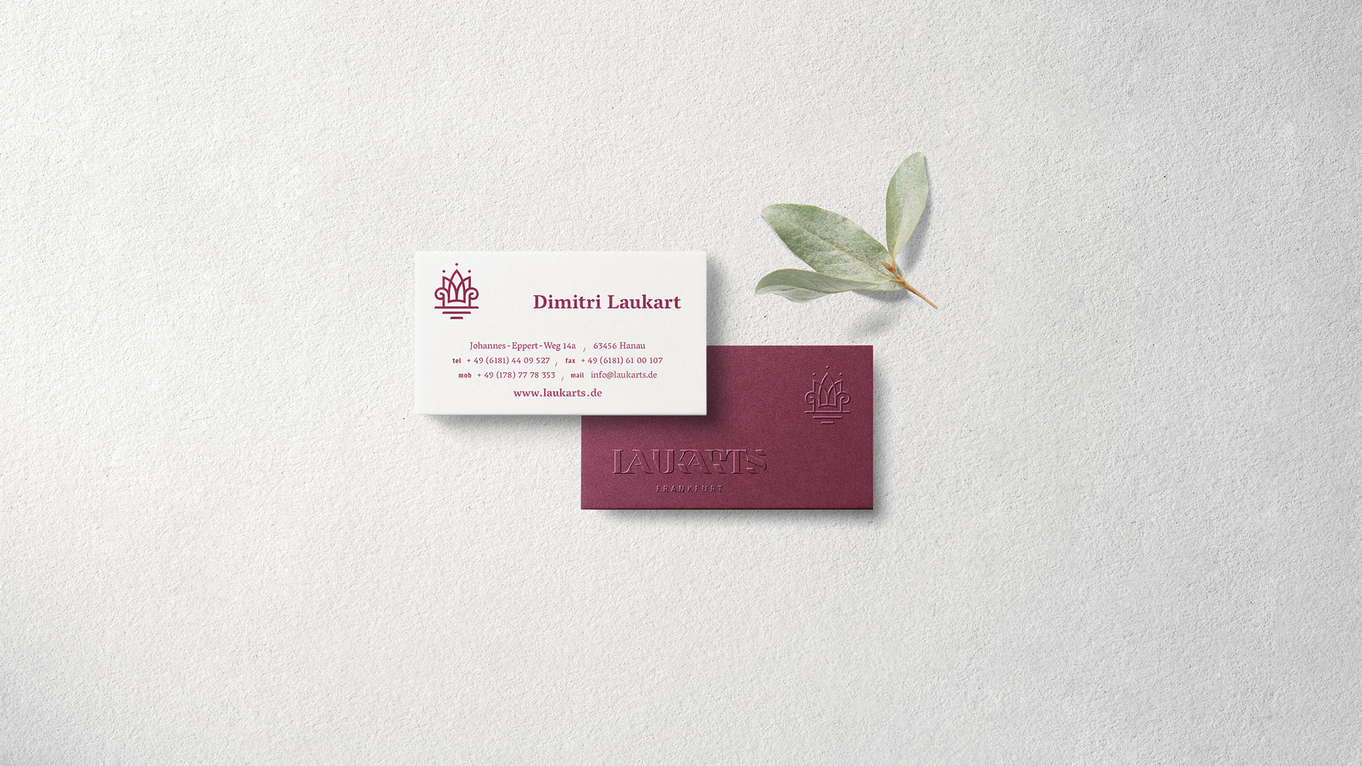
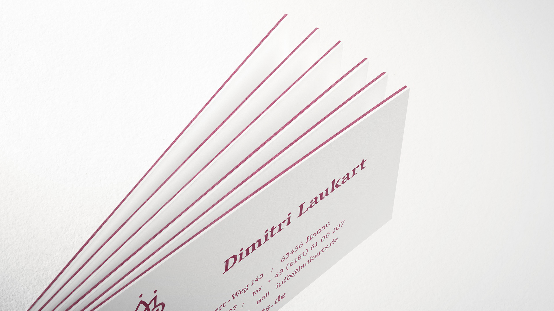
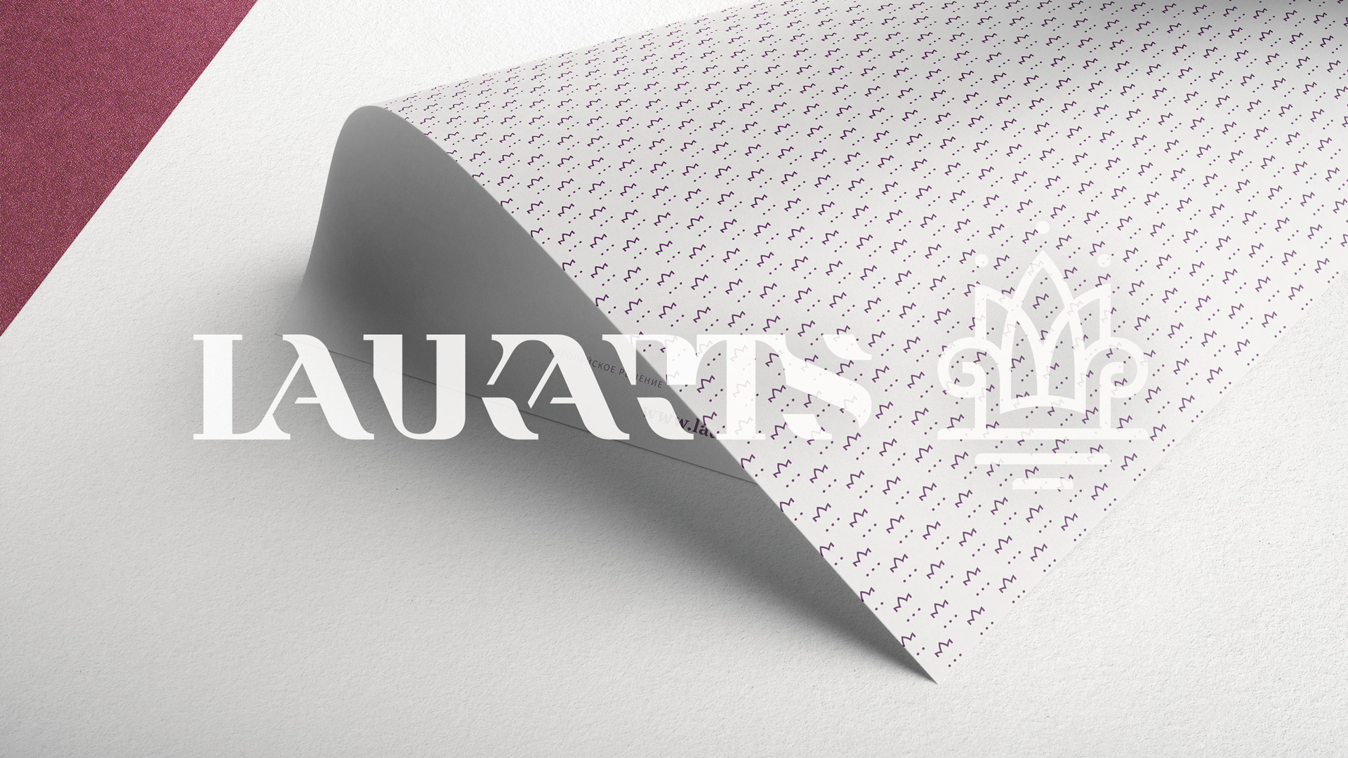
Stationery
Stationery
Brand Guidelines
Prepress
Client
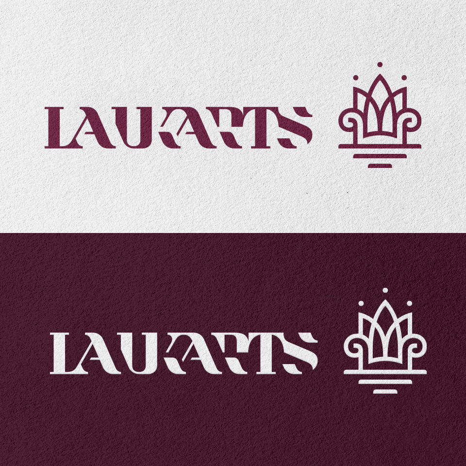
Elena & Dimitri Laukart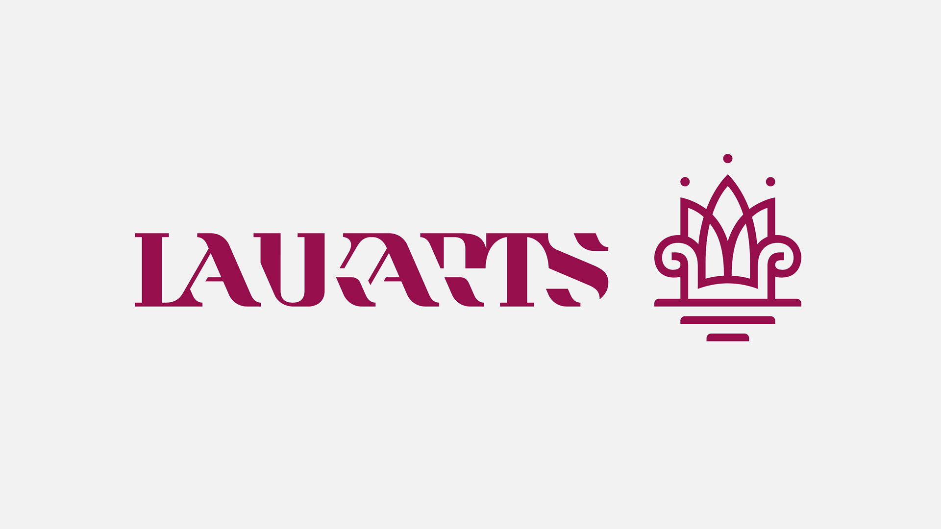
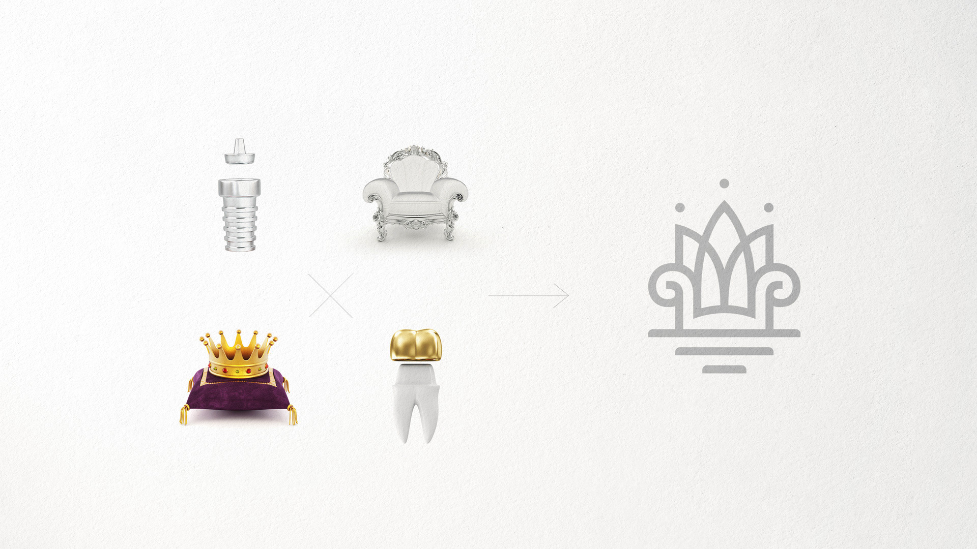
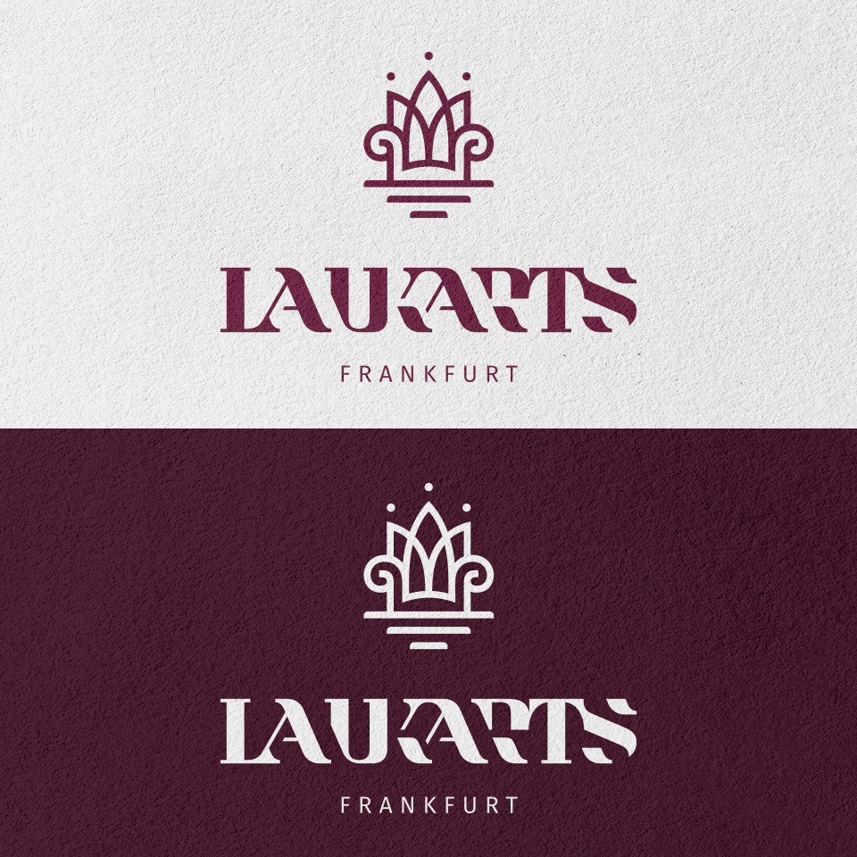
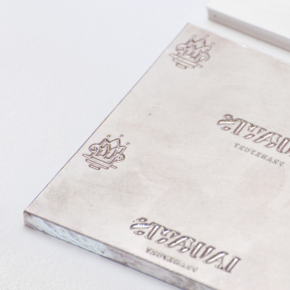
sitting royal
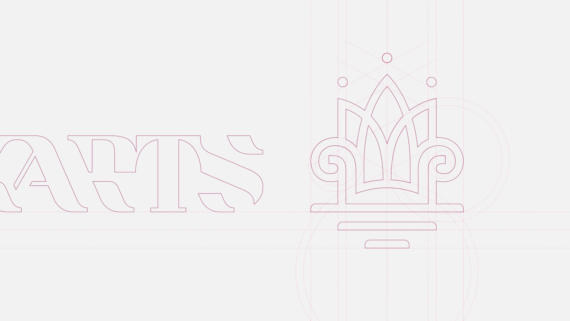
The form of the logotype is mixed of following concepts:
1. a king’s crown as well as a tooth crown known from the dentistry.
1. a king’s crown as well as a tooth crown known from the dentistry.
2. a thron with double meaning also: on one side it may be a king’s thron, on the other it stands for stable placed dental implants.
Representing comfortableness, luxury and stability, the form creates the unique feeling of esthetics & highest level of service. And that feeling is very precious for the clients, who are able & willing to pay a lot for a treatment in Europe.