

Small but mighty,
frame by frame!
2013
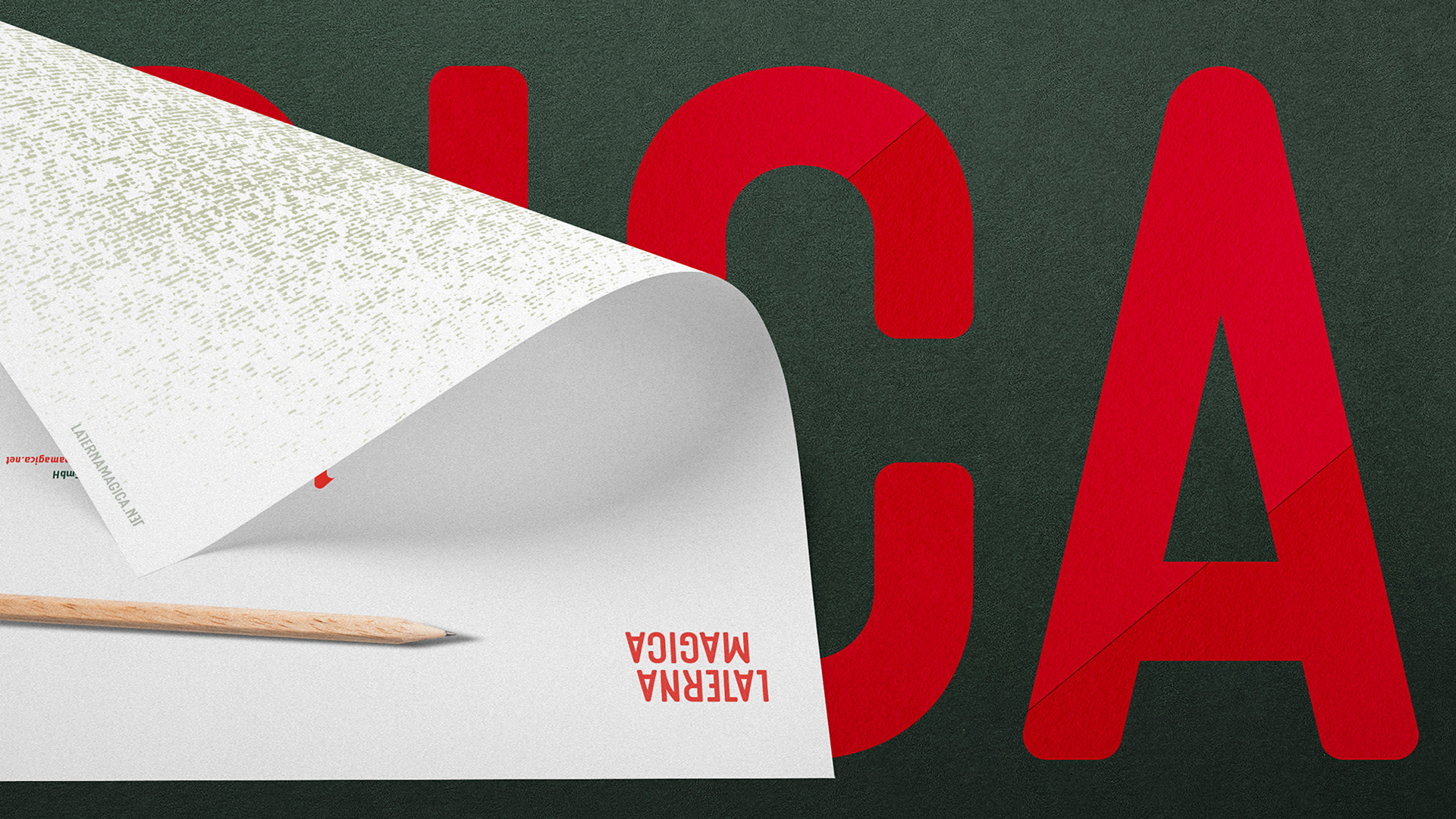
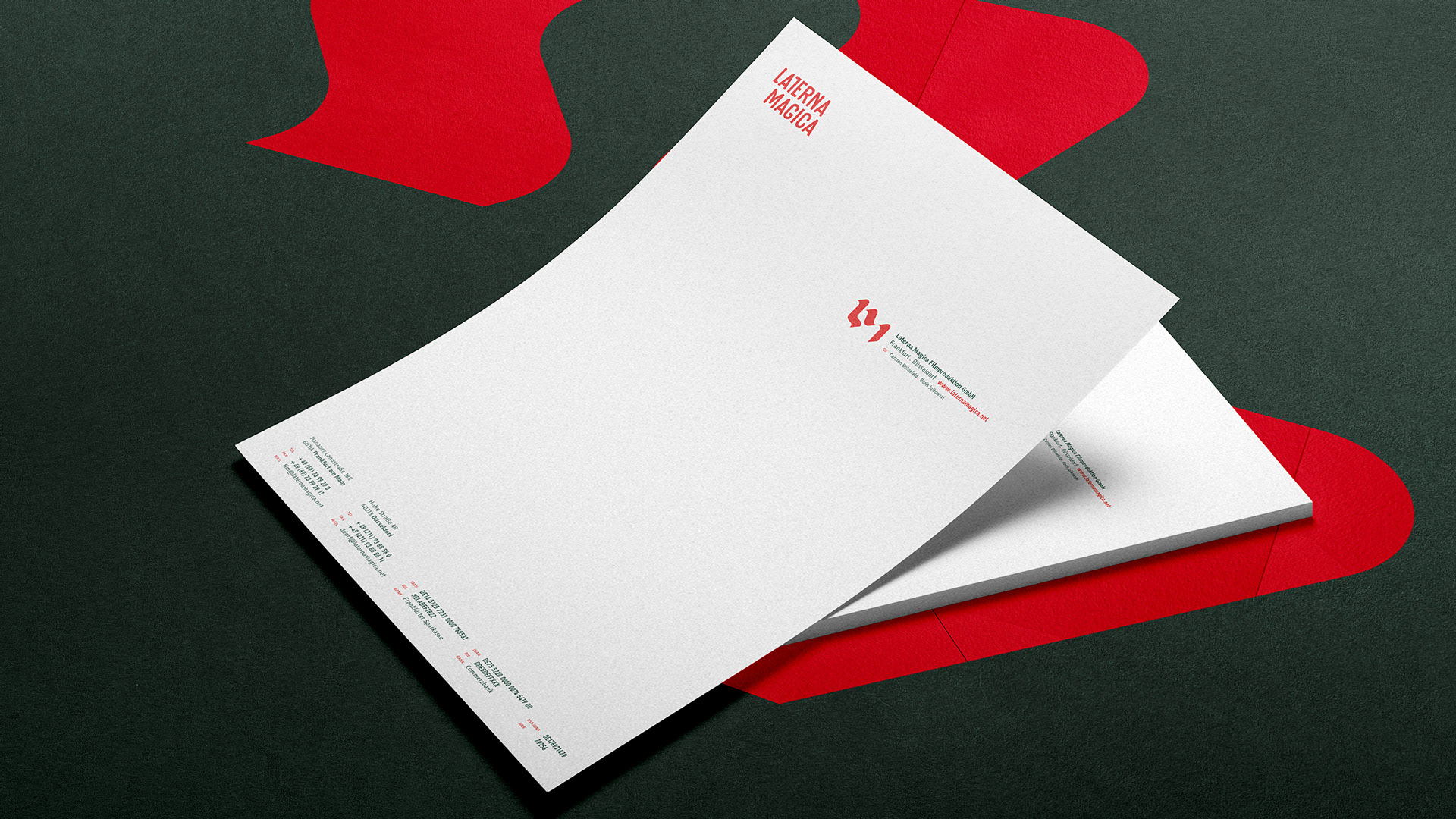
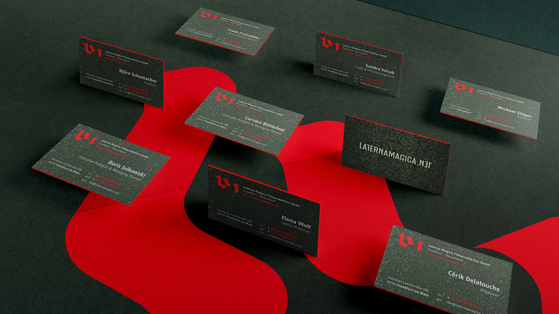
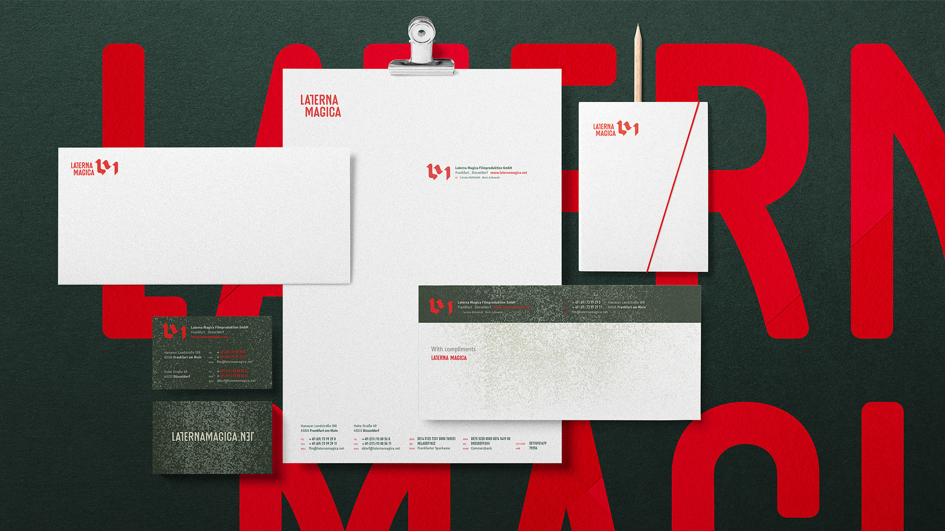
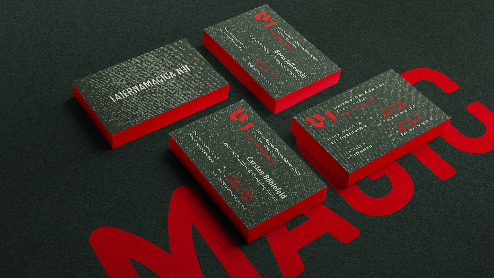
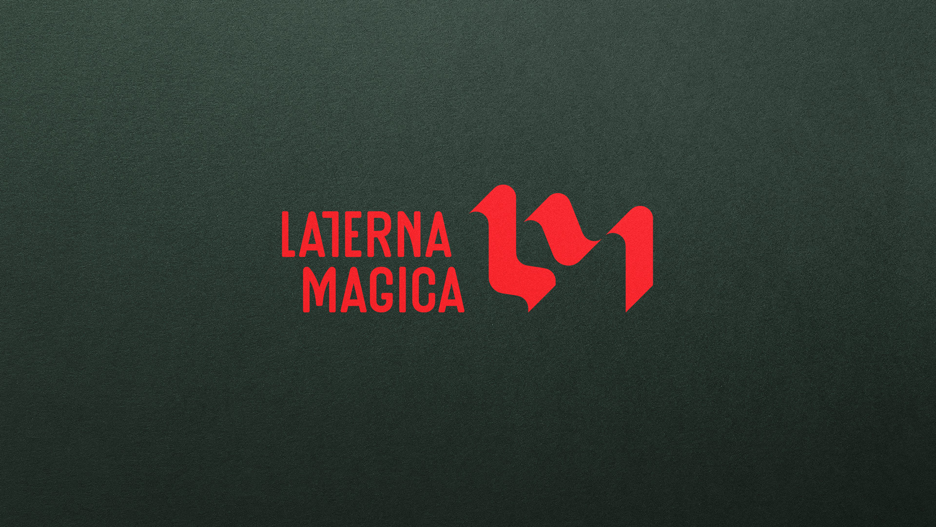
Small but mighty & passionate filmproduction company Laterna Magica needed to refresh their complete corporate identity. The client has been on the market for 10 years and is represented in Düsseldorf and Frankfurt. Over several hundreds of produced films and animations, lots of creativity and experience and owner-involvement in every project are the trademark of this friendly and competent firm. Everything from the logo concept to the colors should get changed. The logo form resulted from the interaction of light and shadow and the texture comes from the white noise. Two special pantone’s were chosen for printing, and the red one highlights perfect the card’s edges.
Art Direction
Branding
Logo Redesign
Branding
Logo Redesign
Brand Guidelines
Stationery
Prepress
Prepress
Client
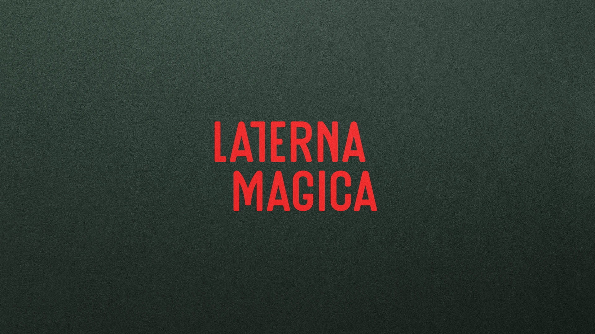
Laterna Magica
Filmproduction