

Synergetic mix of
Tennis & Calisthenics
Tennis & Calisthenics
2017 – 2019
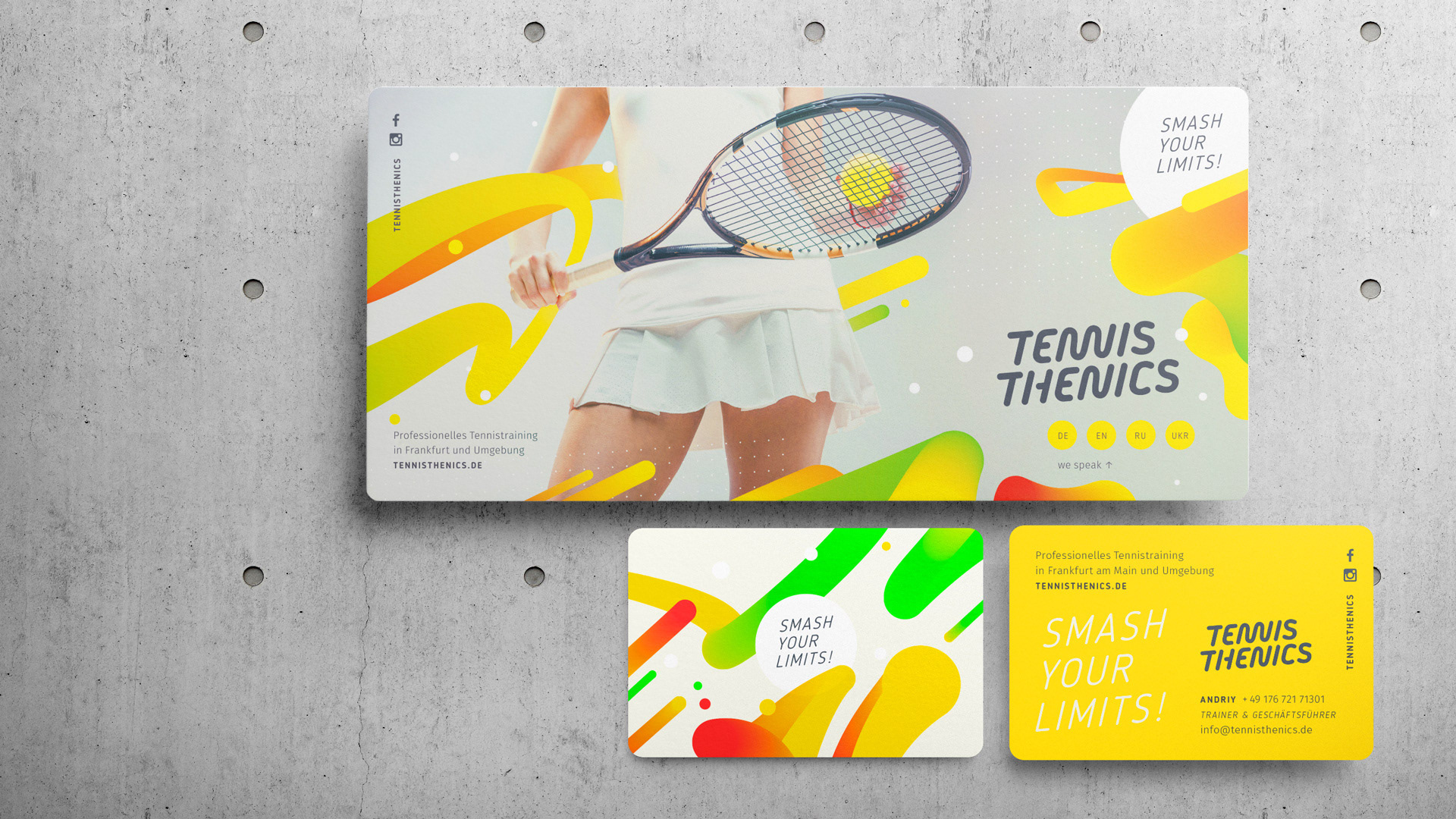
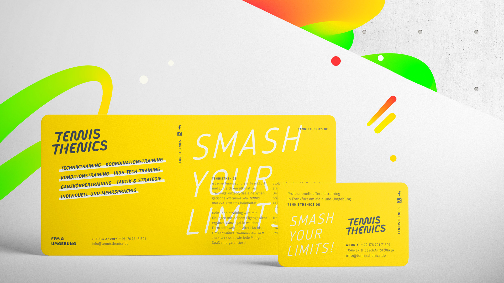
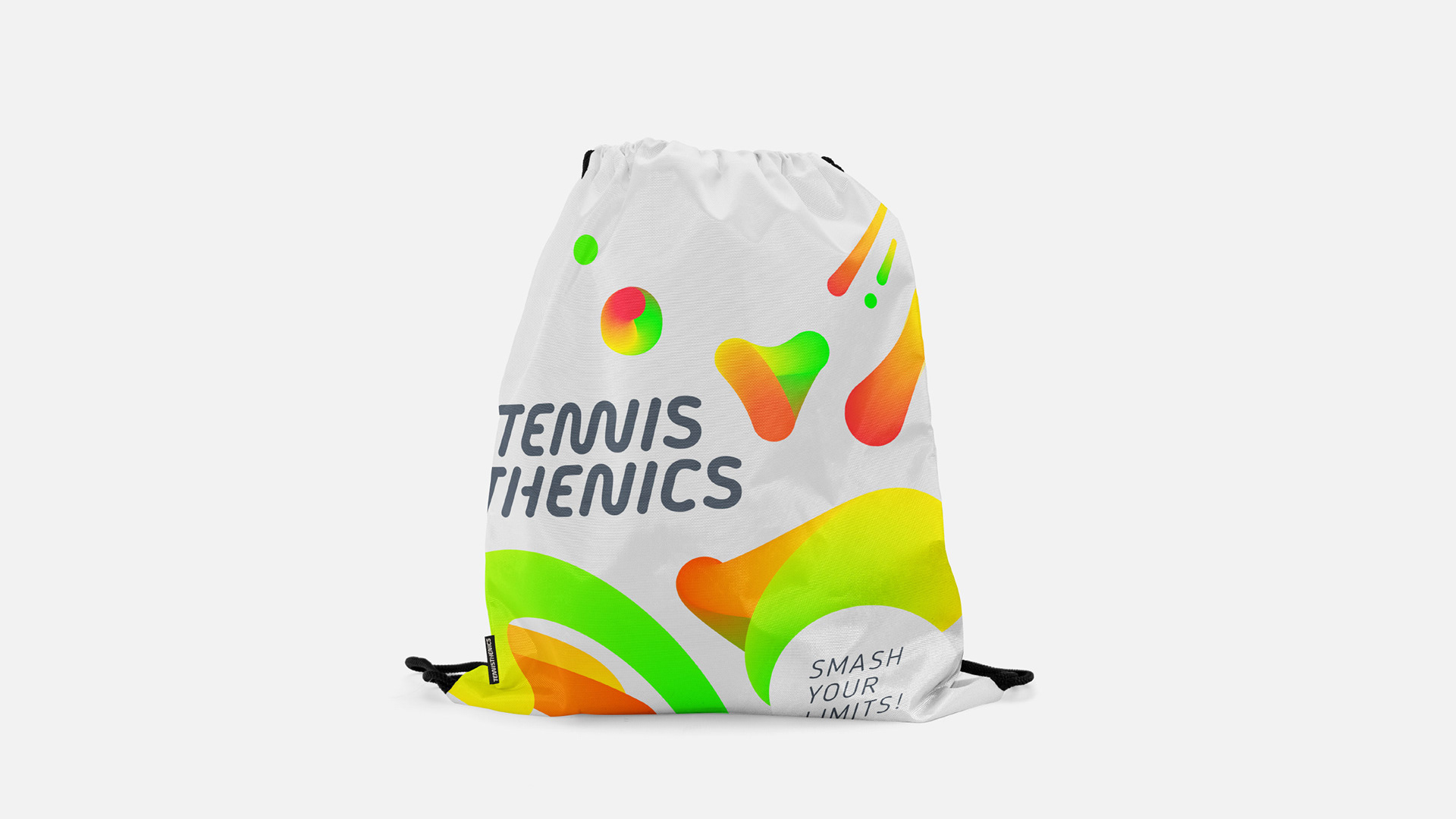
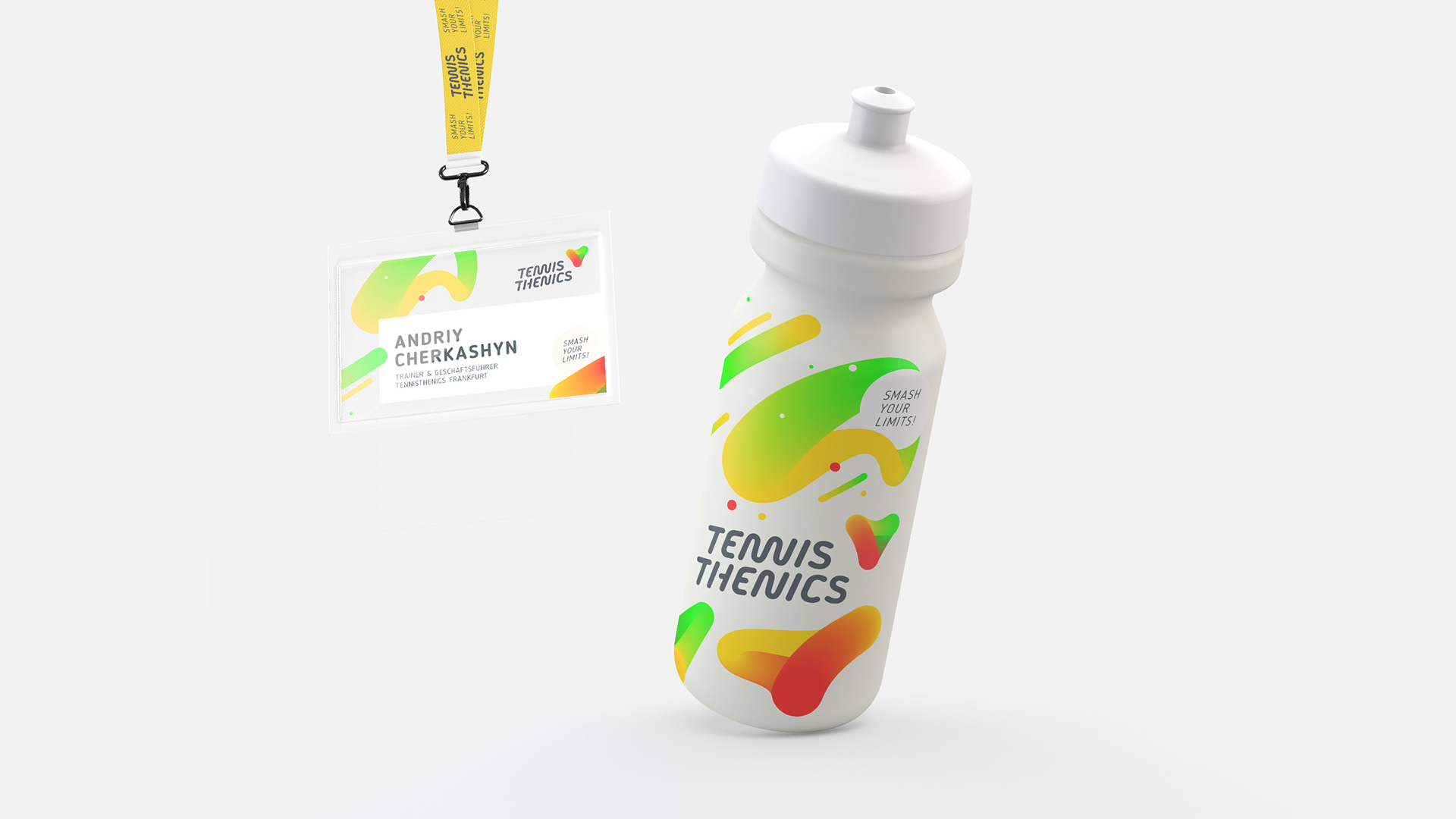
Tennisthenics is a unique concept of training based on synergetic mix of tennis and calisthenics. Founded in Frankfurt, Germany this new methodology teaches tennis and calisthenics to people of all ages and helps them to become & stay in shape as well. Due to functional training combined with calisthenics exercises, every person gets a great opportunity to become more functional, to feel happier and healthier in life and society.
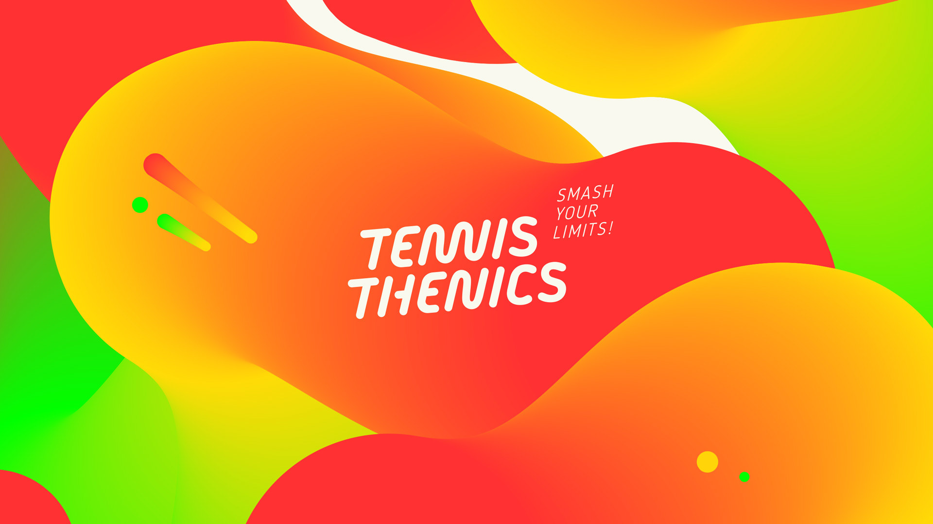
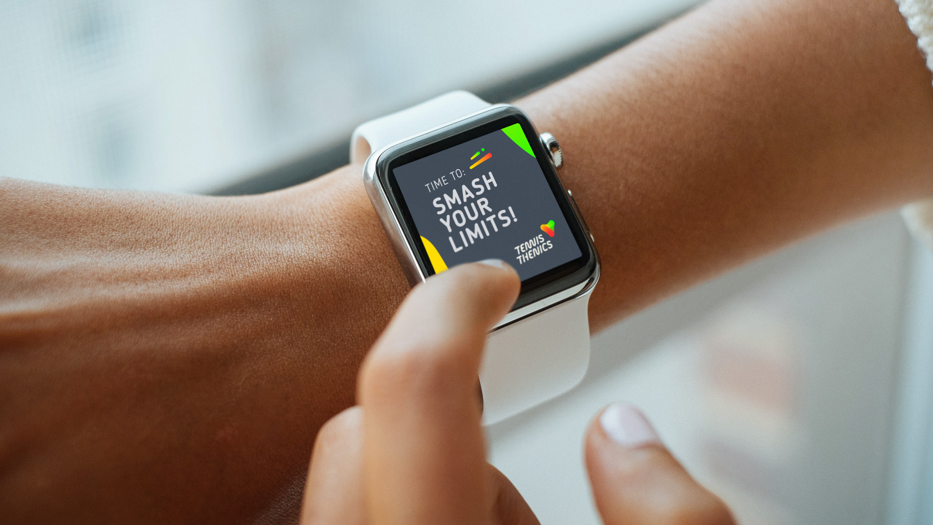
One of the big advantages of Tennisthenics – no membership of any tennis club is needed. Just book your hour and smash your limits on a tennis court of your choice.
Art Direction
Logodesign
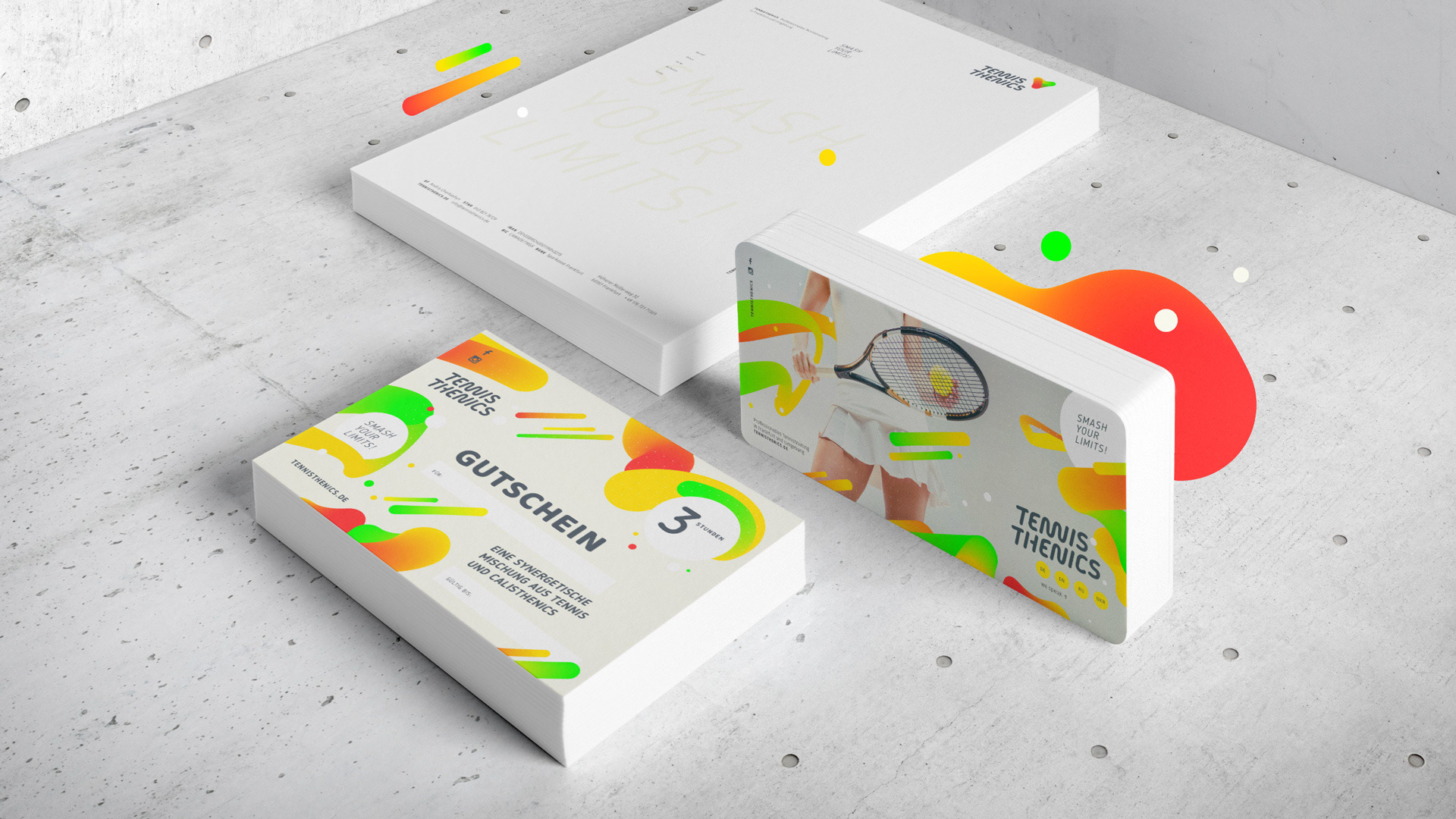
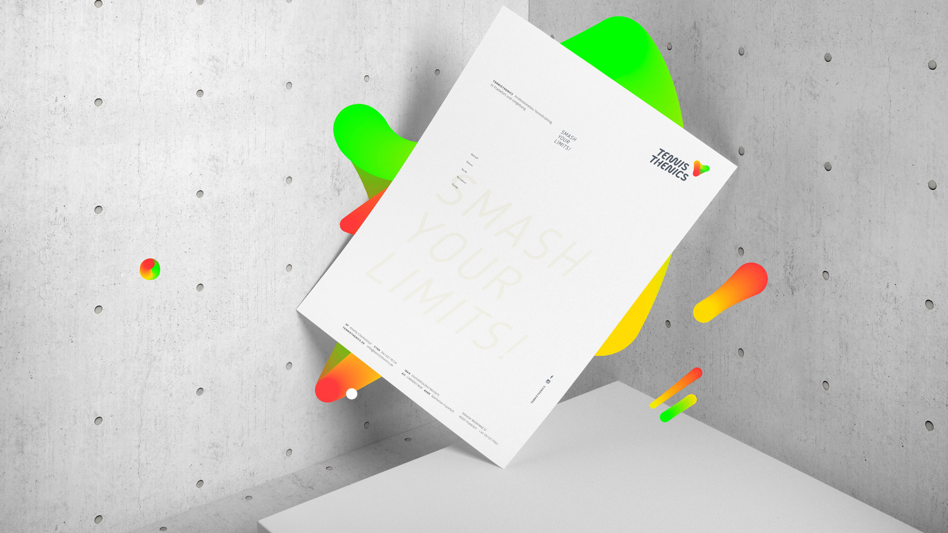
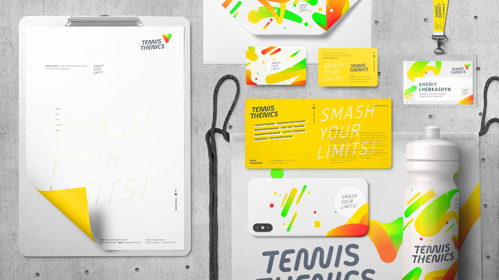
Stationery
Stationery
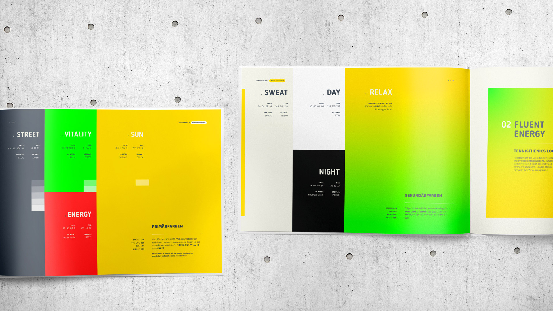
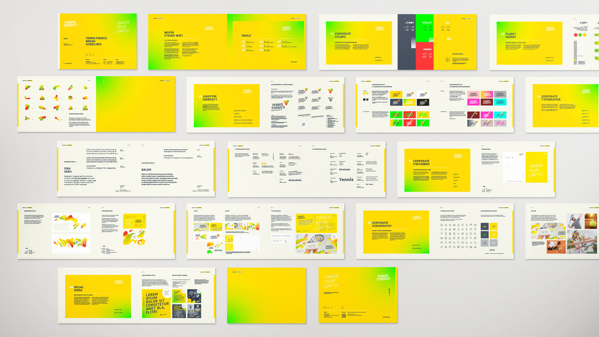
Brand Guidelines
Prepress
UI & UX
Client
Andriy Cherkashyn
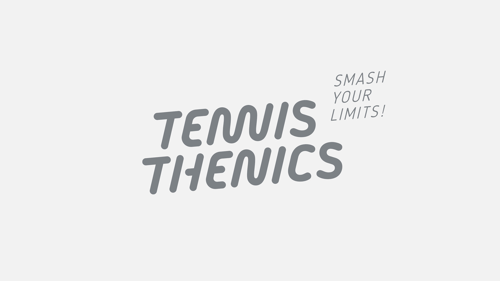
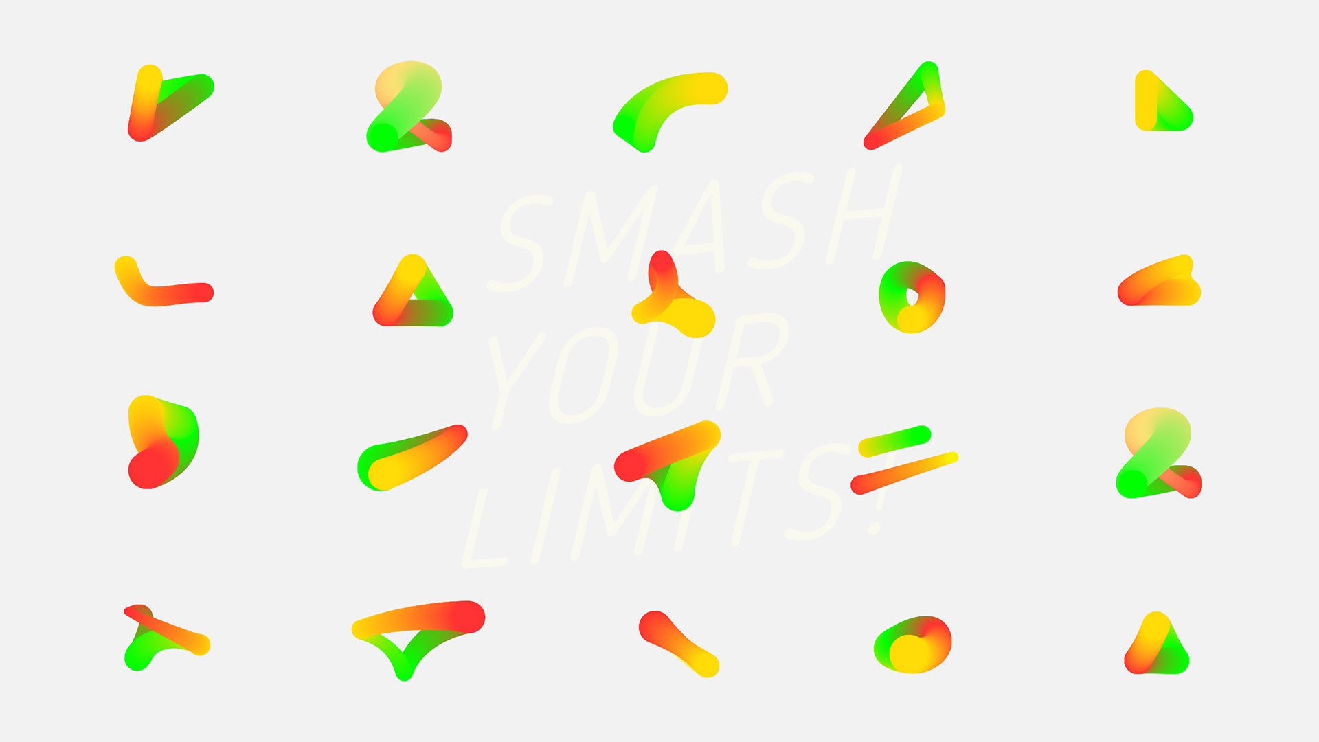
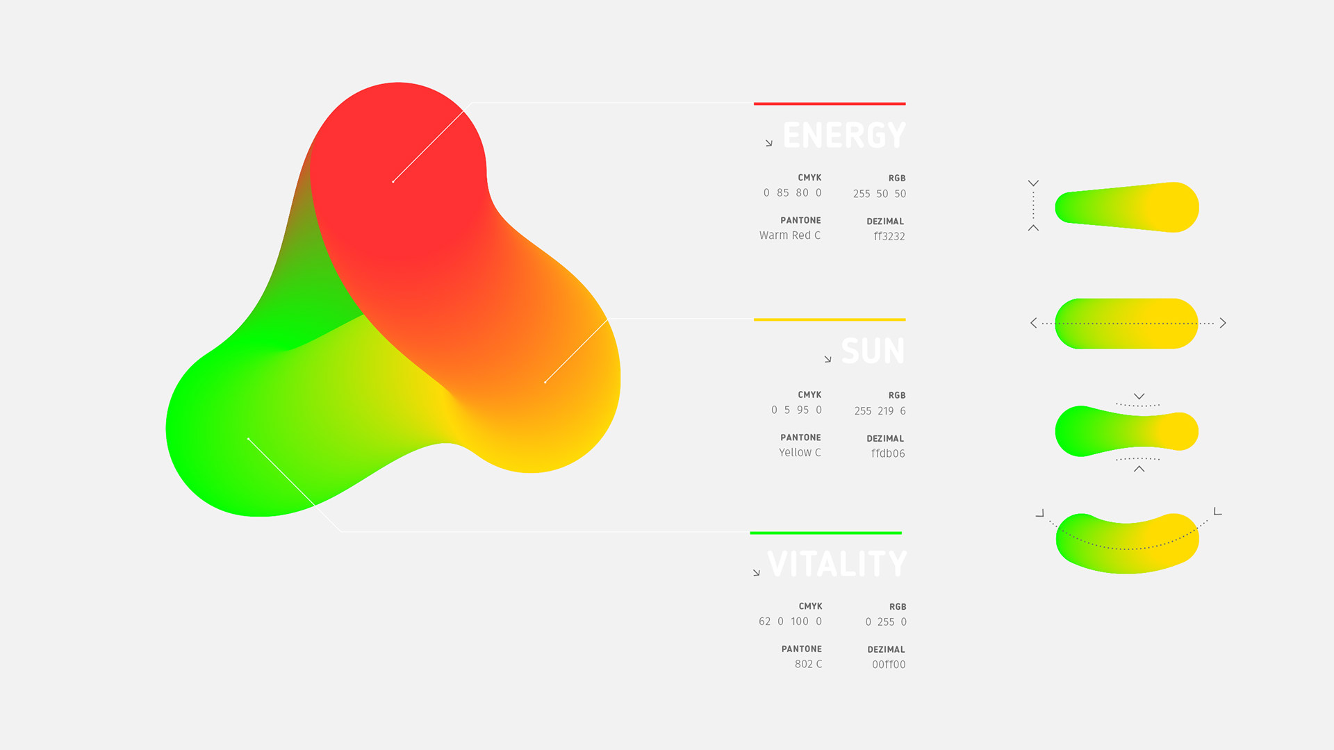
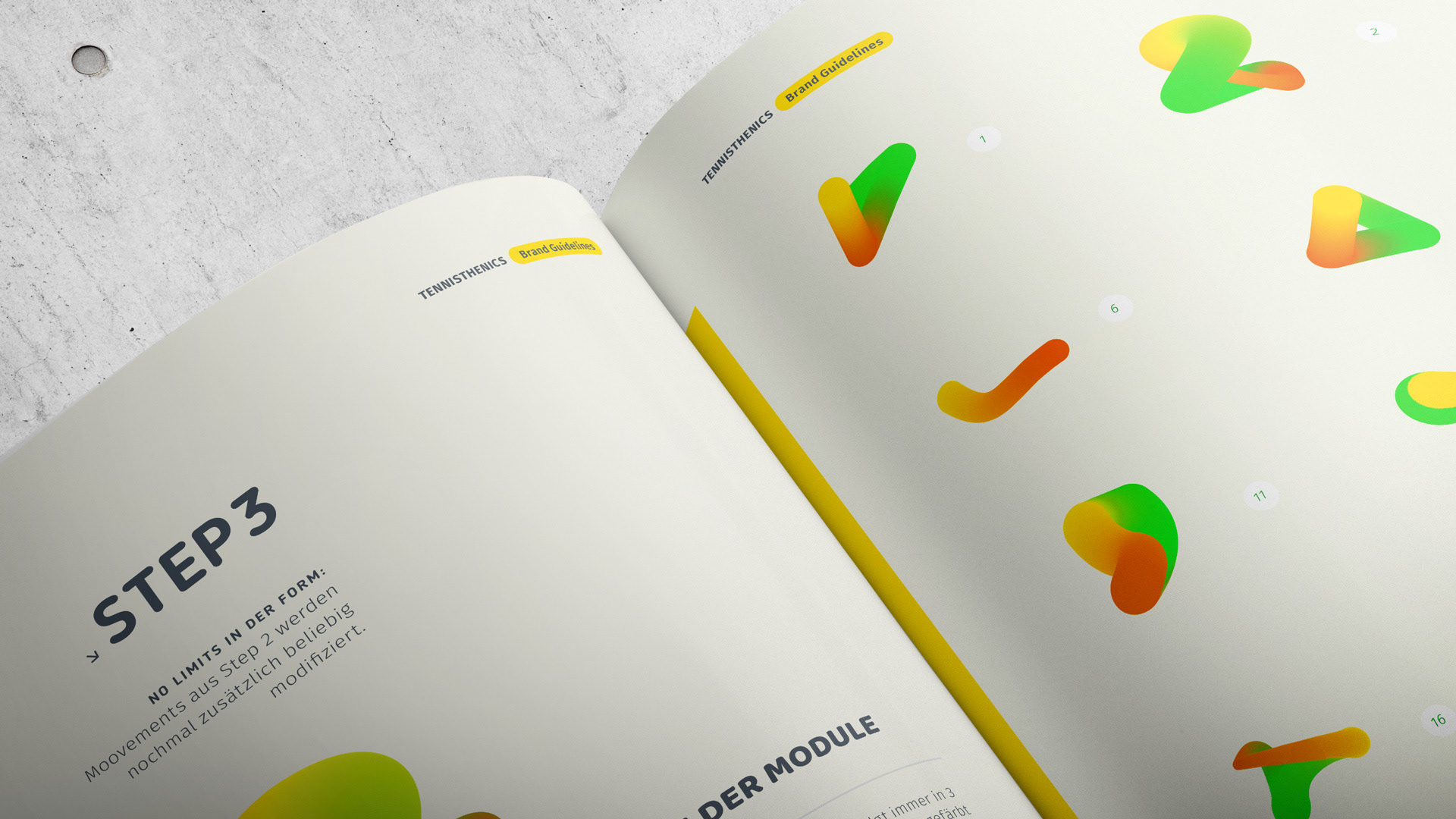
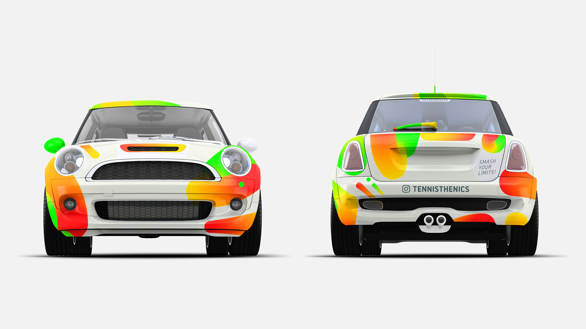
As always, my job was to create the new visual language from the zero. Due to urbanity of the brand the colors are named by energy, sun, vitality, relax, sweat and street, where the training usually takes place. A smooth logotype has been reduced to shapes as tight as possible and slanted by -5° to achieve the speedy look of the young sporty and joyful brand.