

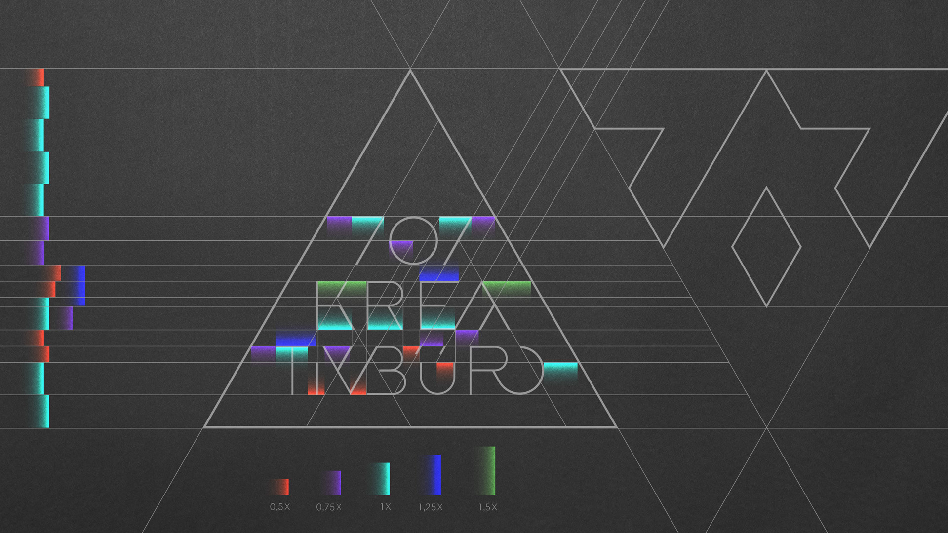
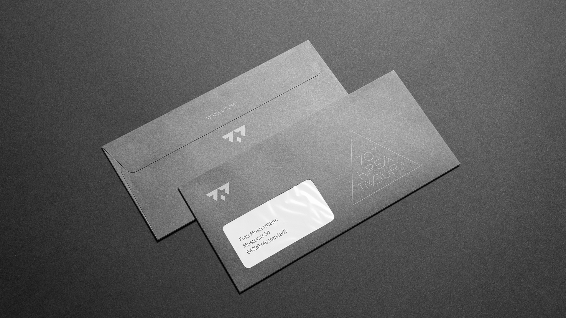
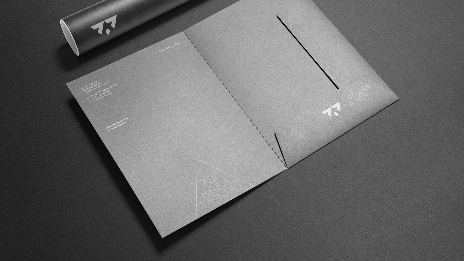
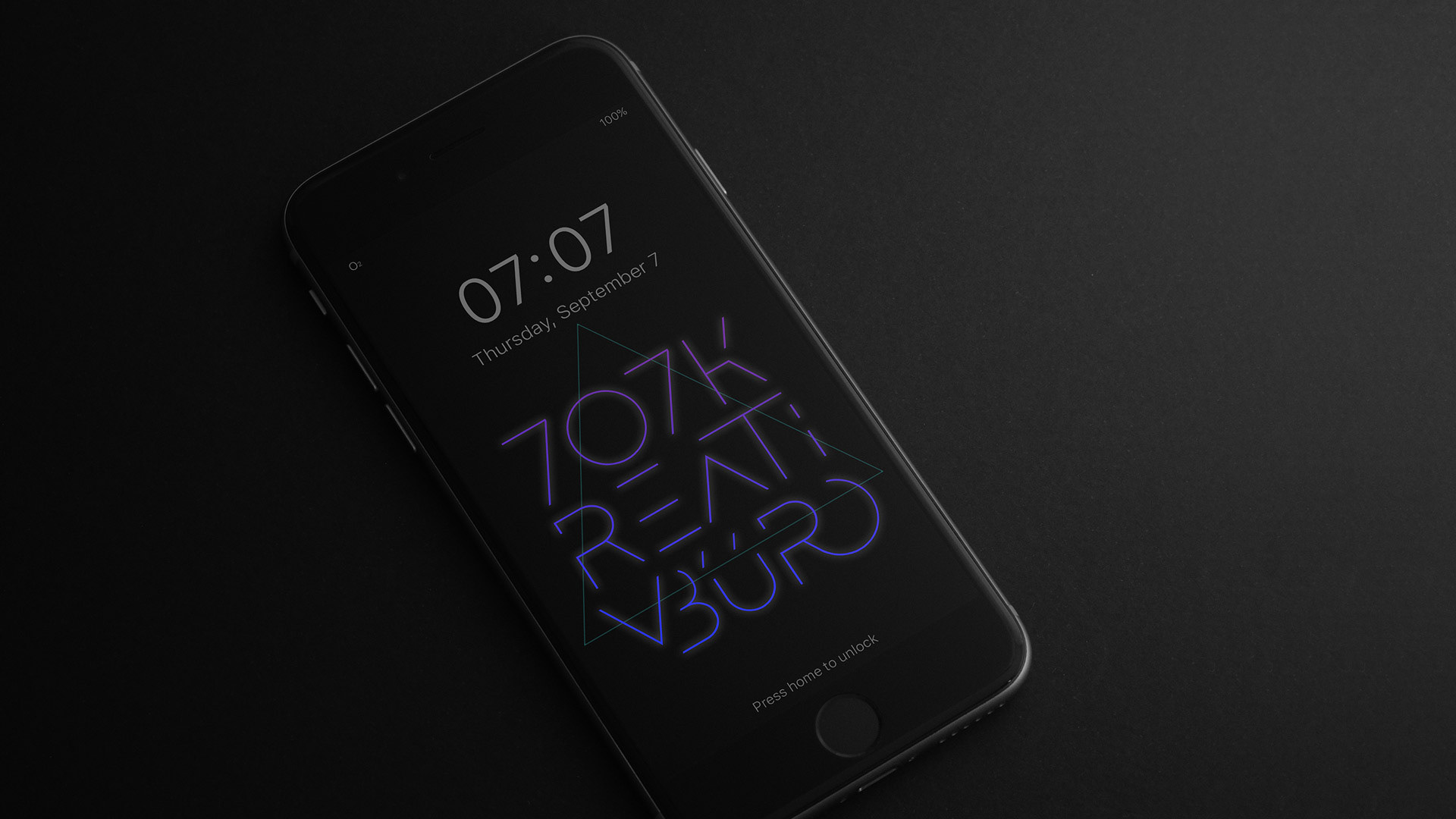
707 Kreativbüro:
dark, simple, radical.
2012, 2017
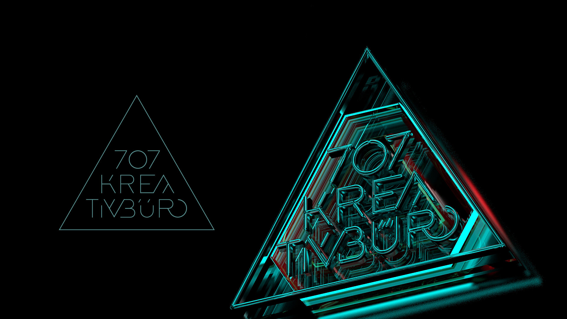
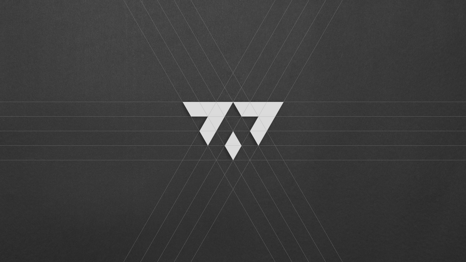
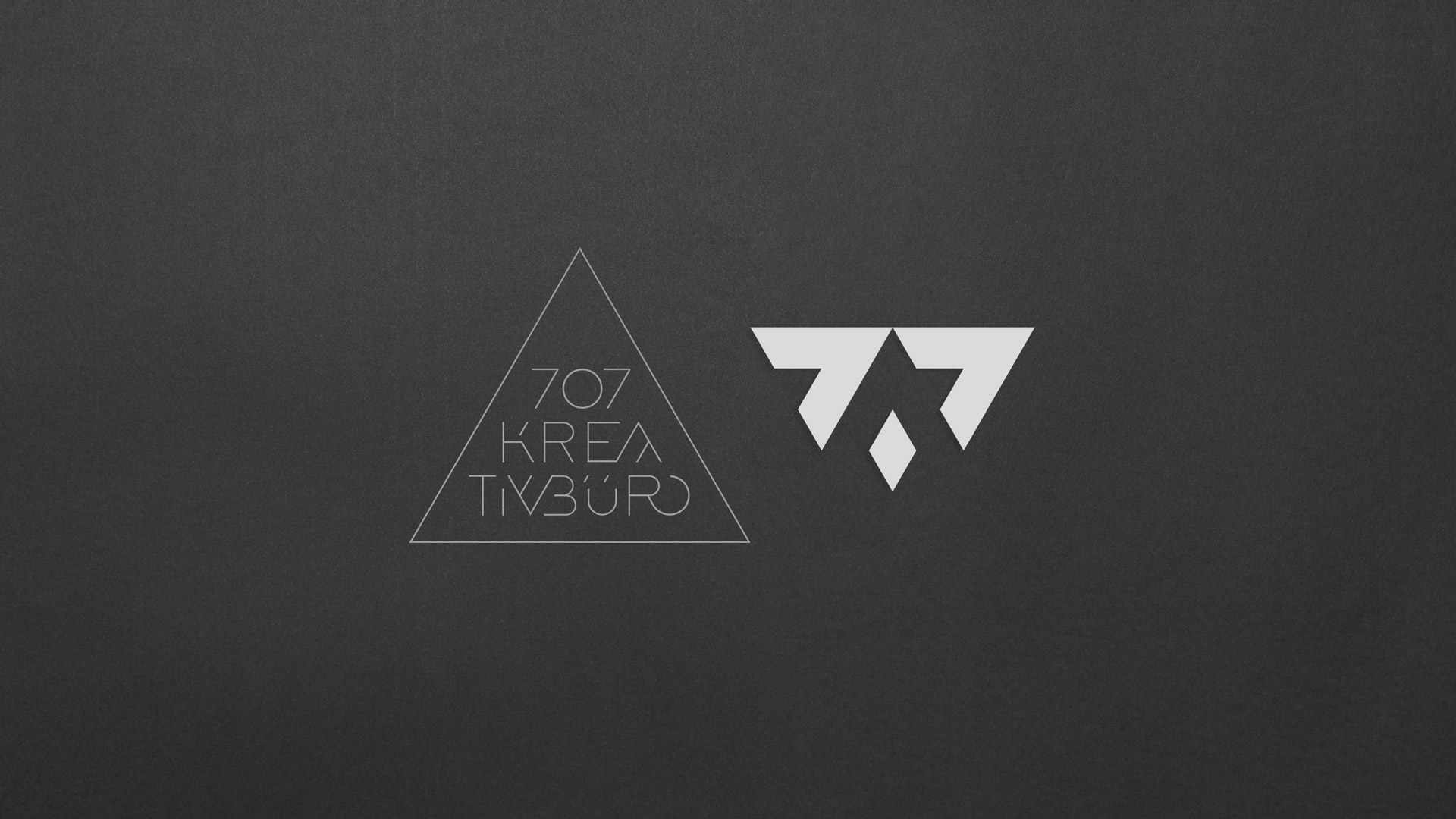
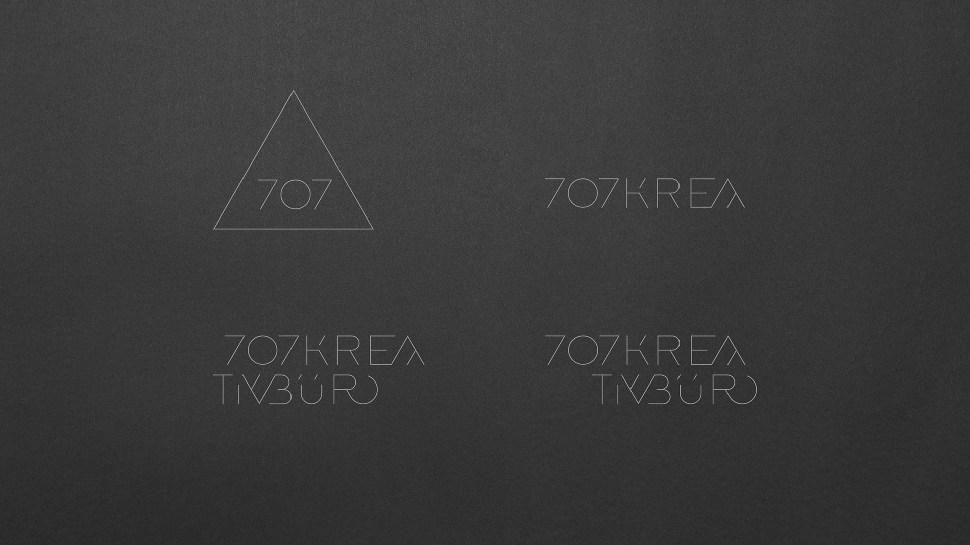
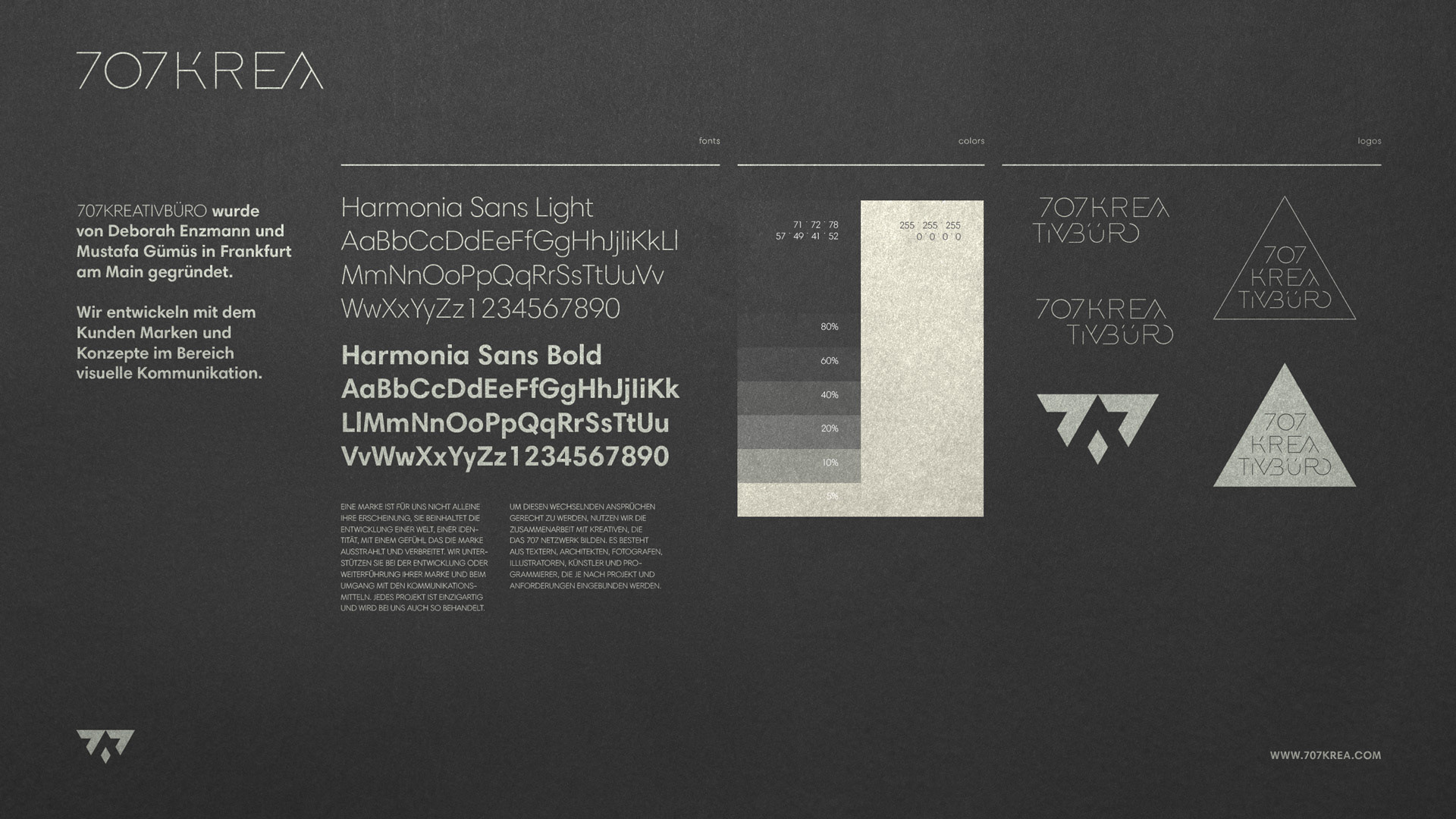
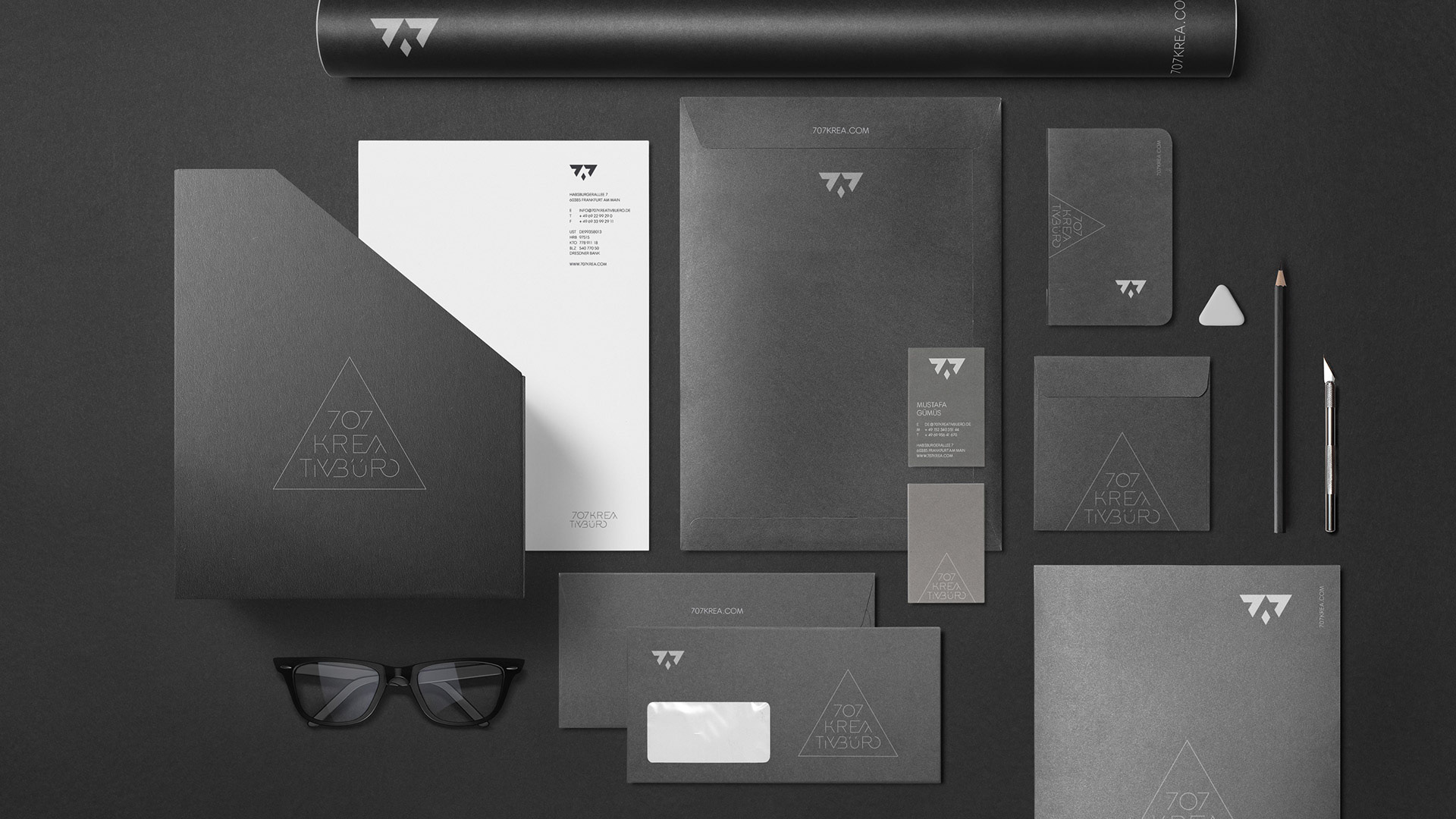
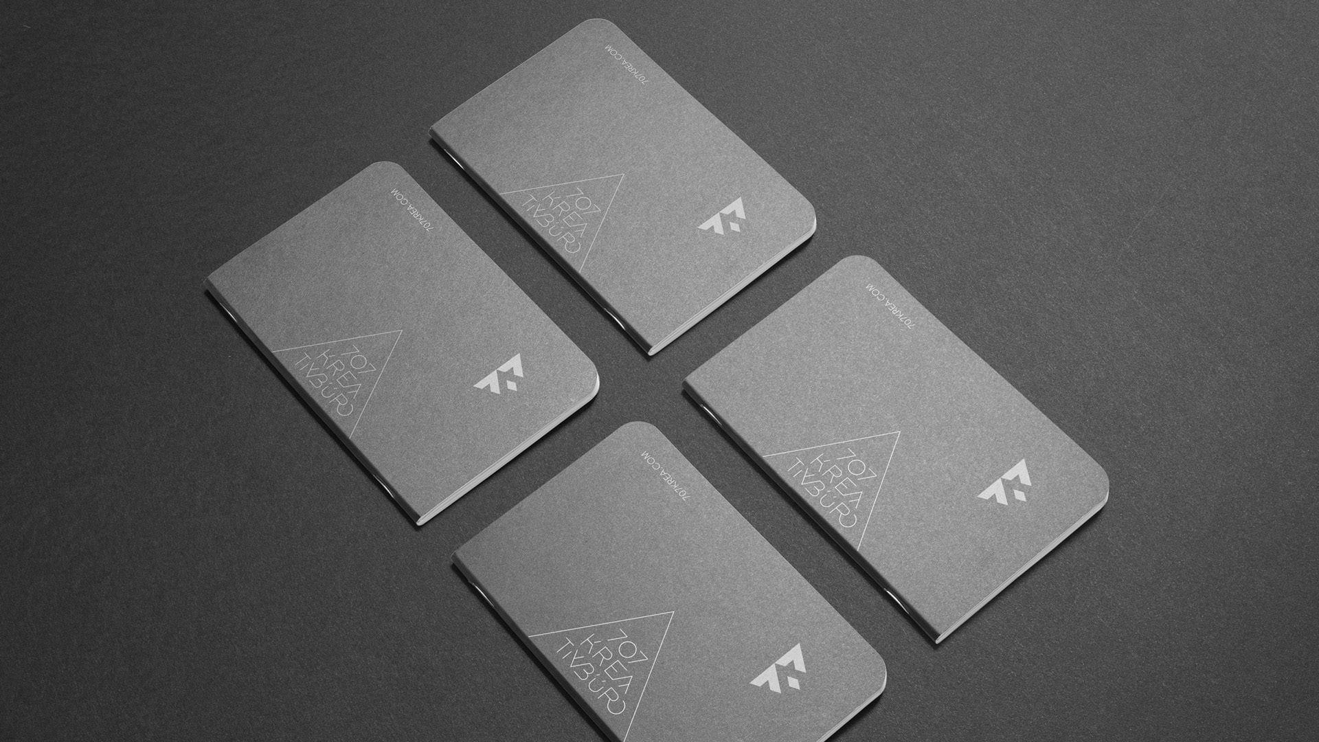
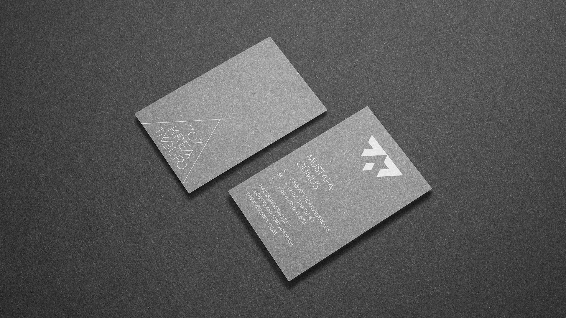
Identity for 707 Krea from Frankfurt. Founded by Deborah Enzmann and Mustafa Gümüs, this small agency designs and develops new brands & concepts mainly in the sector of food and restaurant business. 707 wanted to appear dark, simple and radical. The logo contains two parts which can work together or apart.
Quite different but similar at the same time, they level up and round out each other depending on the situation in the job or life. Recently they also have celebrated a marriage – indeed their biggest project so far.
Art Direction
Naming
Logodesign
Naming
Logodesign
Stationery
Prepress
Prepress
Client
Deborah Enzmann
Mustafa Gümüs
Mustafa Gümüs
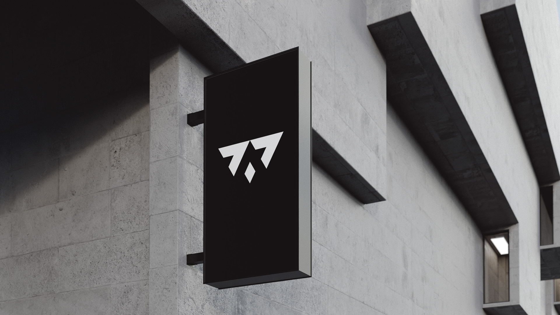
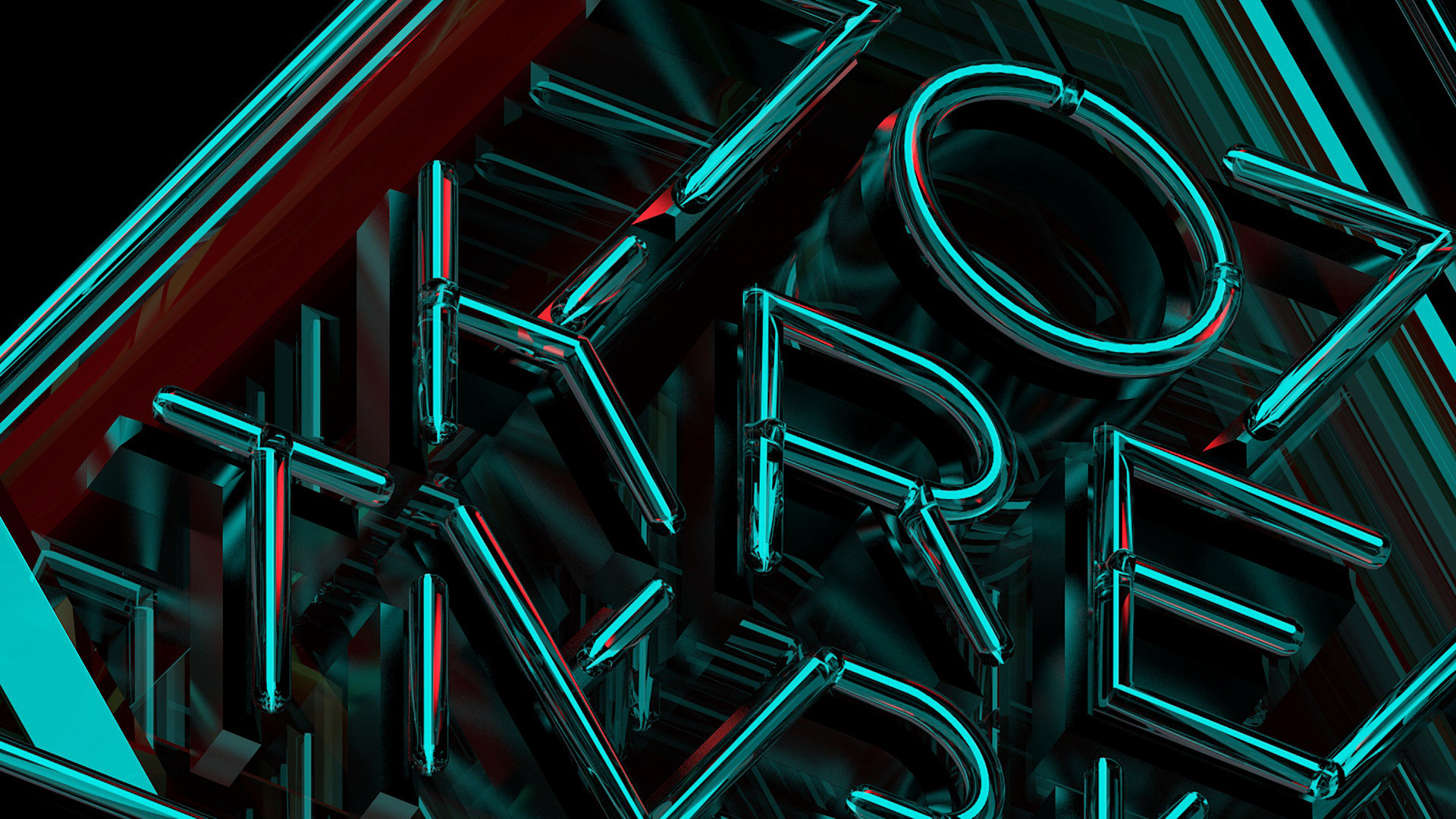
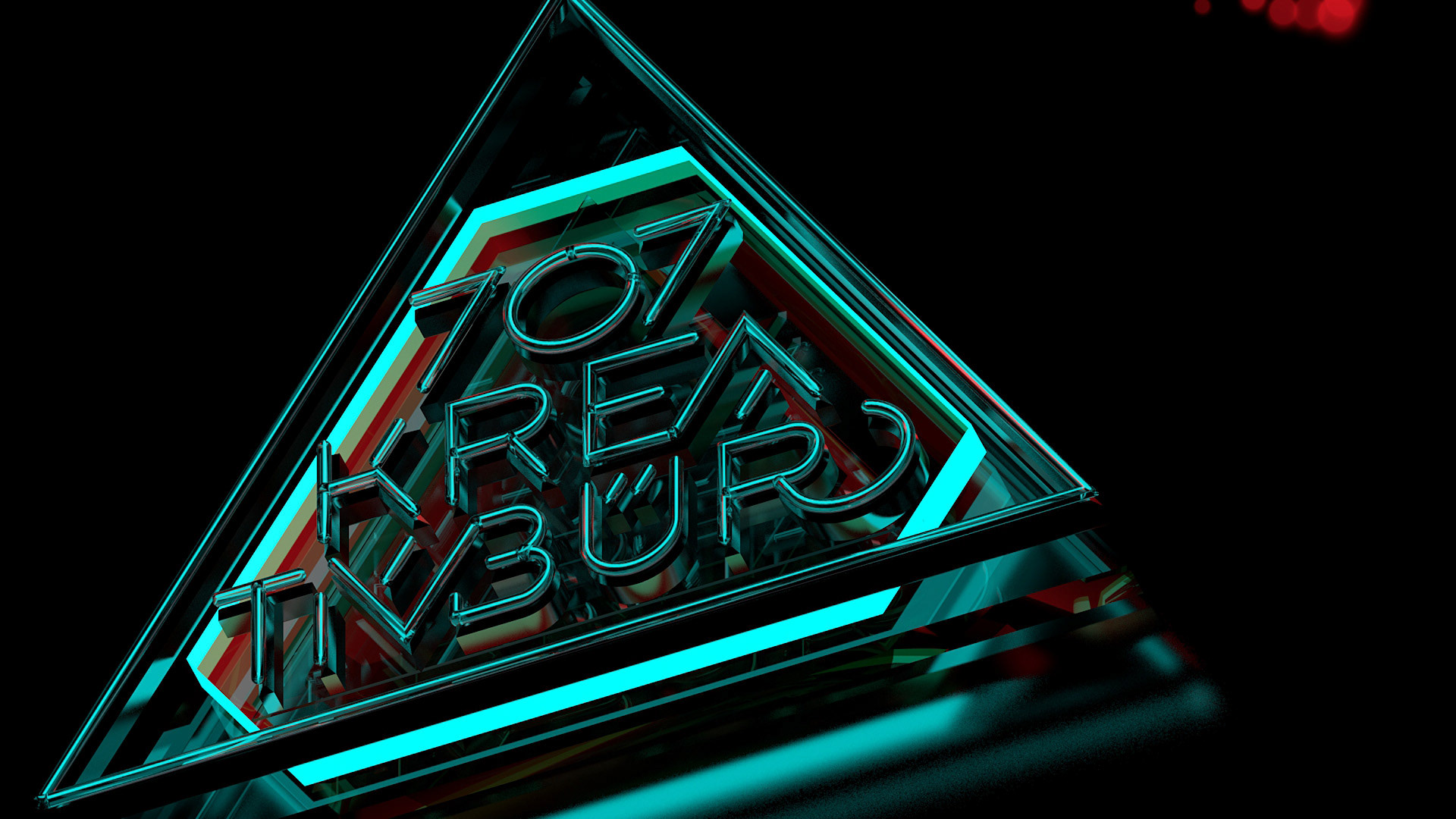
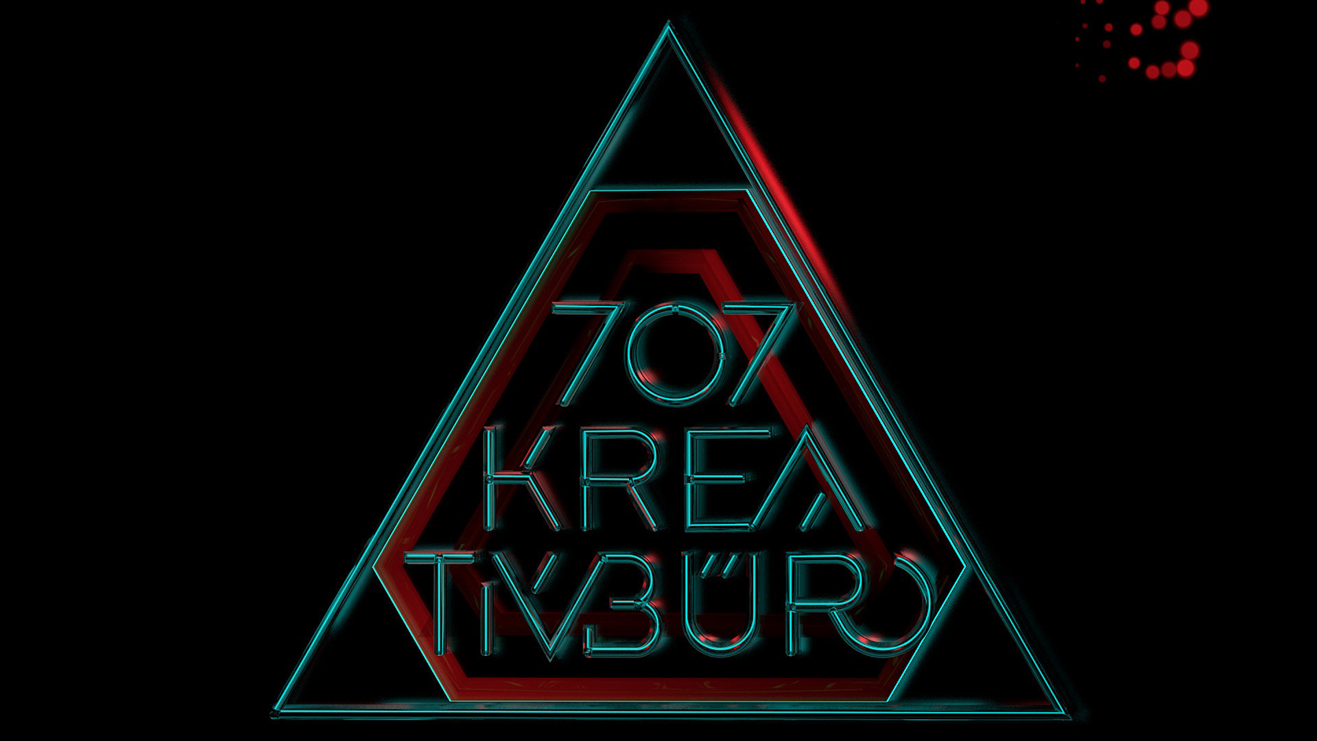
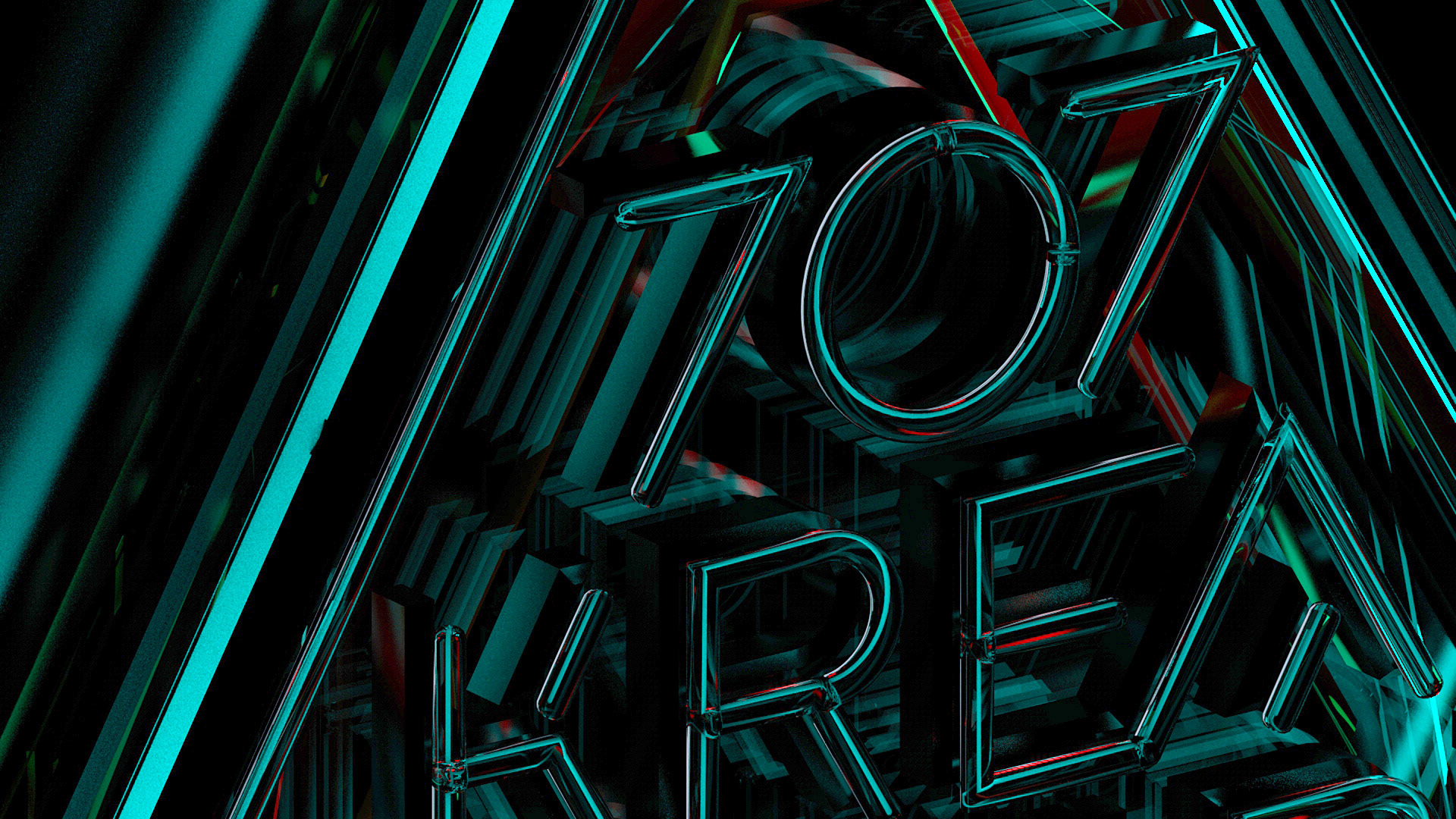
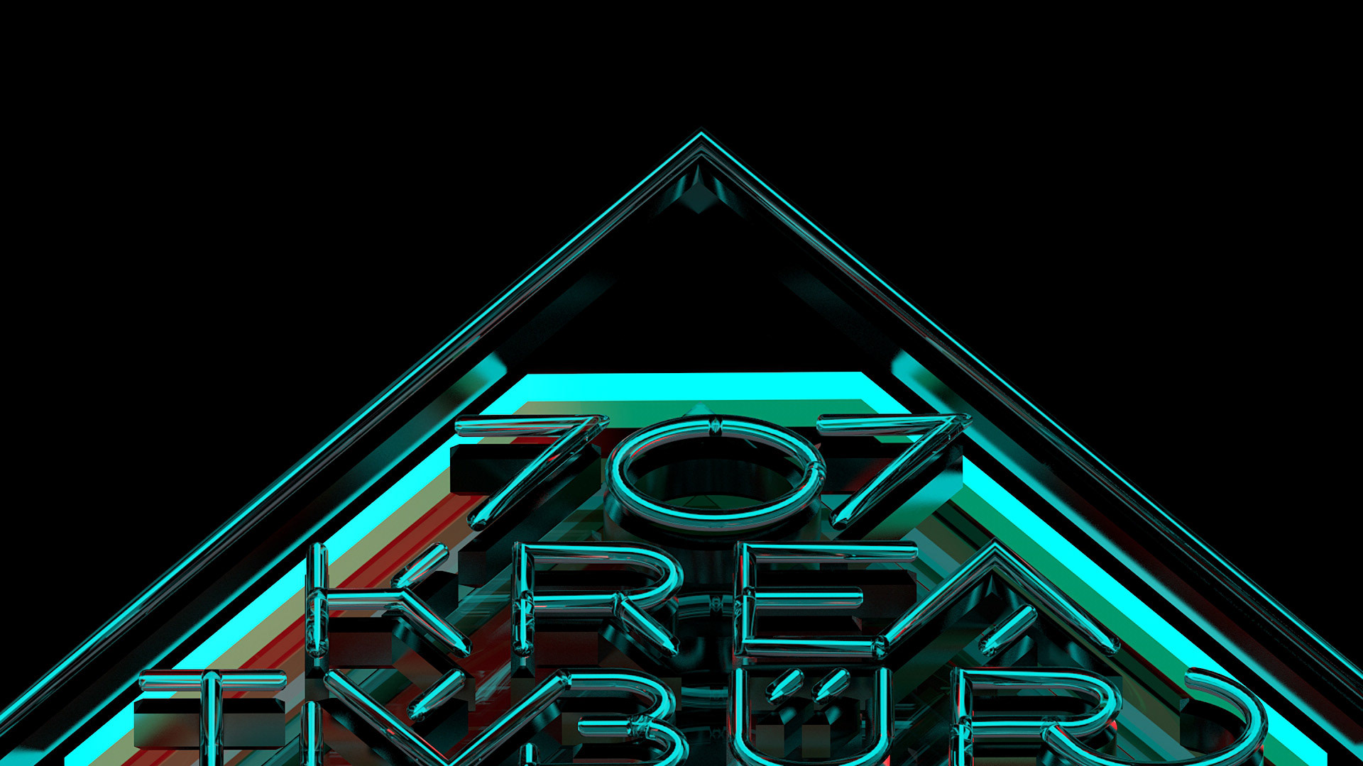
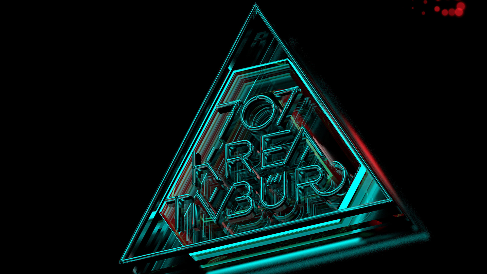
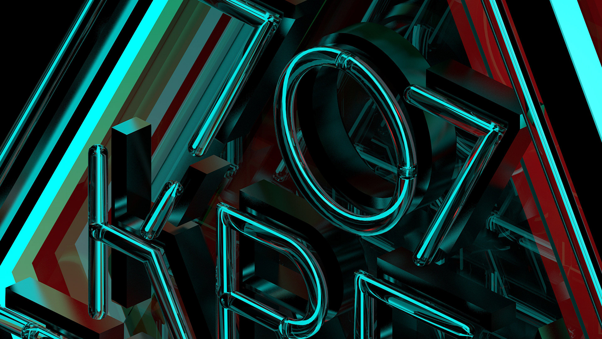
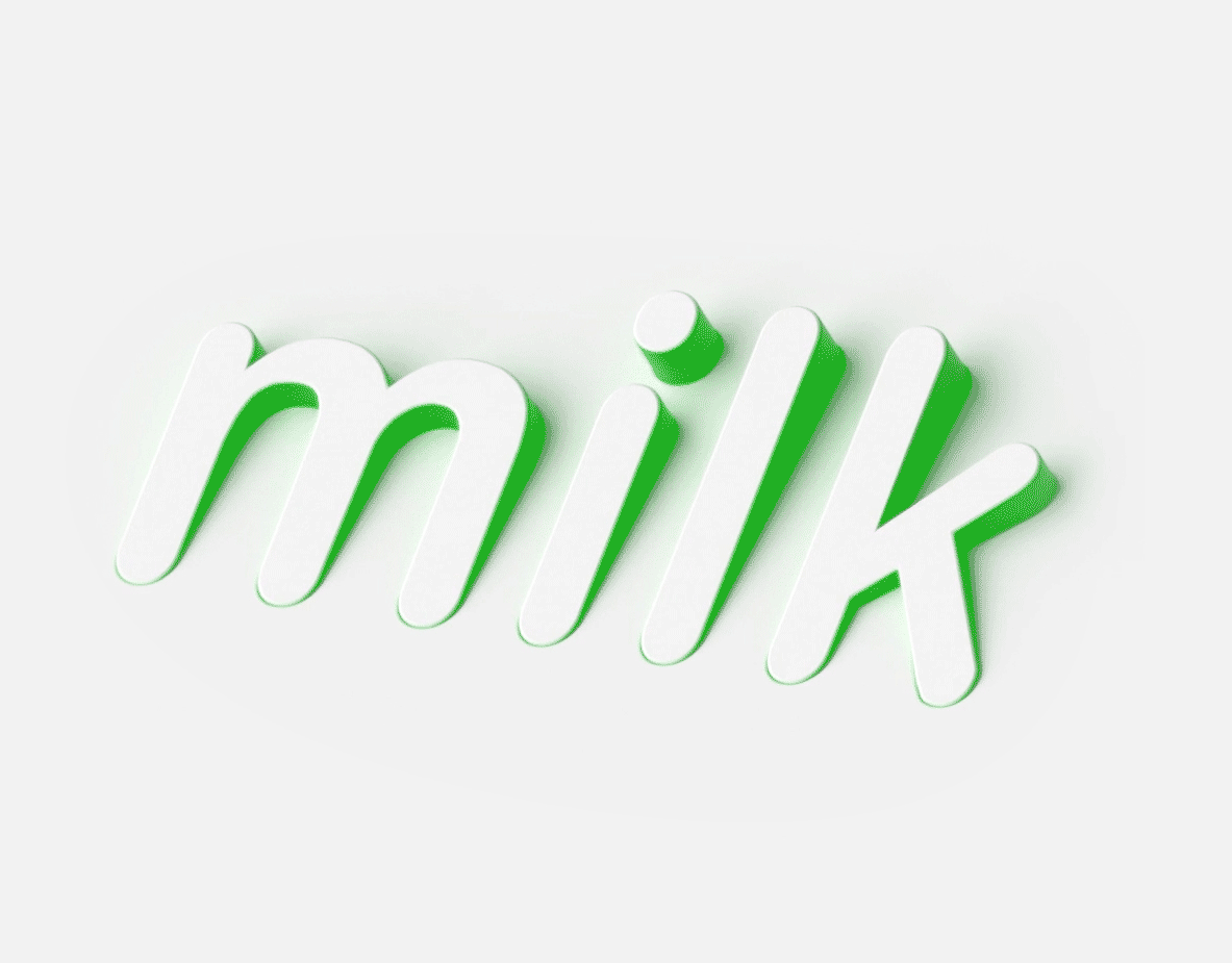
707 3D
Creating some redesign of an old logo from 2012 was a perfect chance to learn 3D. The new sign was made of semi-transparent glas, metal & neon plastic, illuminated and layered on top of each other. All under the proved motto “dark, simple, radical”.
Creating some redesign of an old logo from 2012 was a perfect chance to learn 3D. The new sign was made of semi-transparent glas, metal & neon plastic, illuminated and layered on top of each other. All under the proved motto “dark, simple, radical”.